for designers
for Designers
Rules for the correct use of the logo and its replication.
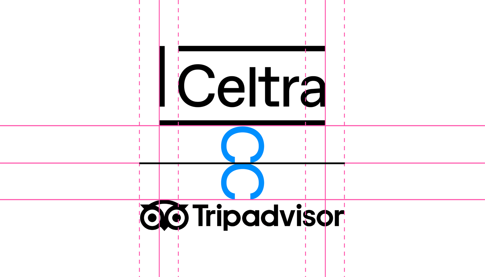
Celtra Logo
A primary communication element.
Celtra Symbol
Used for limited sizes and social media avatars.
CA & CE Logos
Pairs Celtra logo with its products.
CA & CE Symbol
Used for limited sizes on products.
Internal Teams
Departments can have their own distinct wordmark.
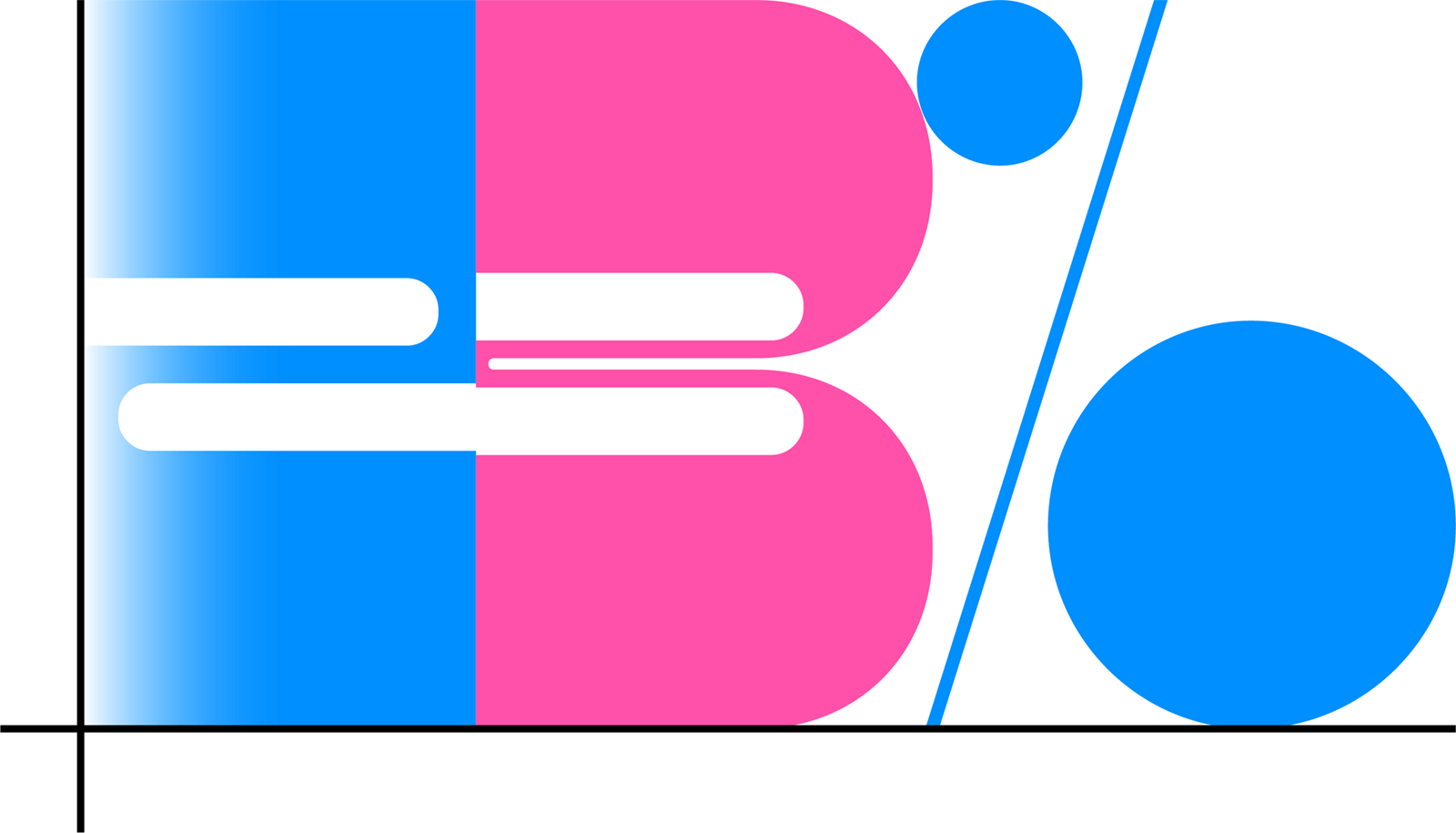
The Celtra logo represents a frame based on the grids that form the visual identity. It’s carefully constructed to maintain its ownable characteristics while allowing a high degree of legibility at any size on any application.
The logo is designed to scale to small sizes on print and screen.
Smallest size: 20 pixels / 0.3 inch / 8 mm height.
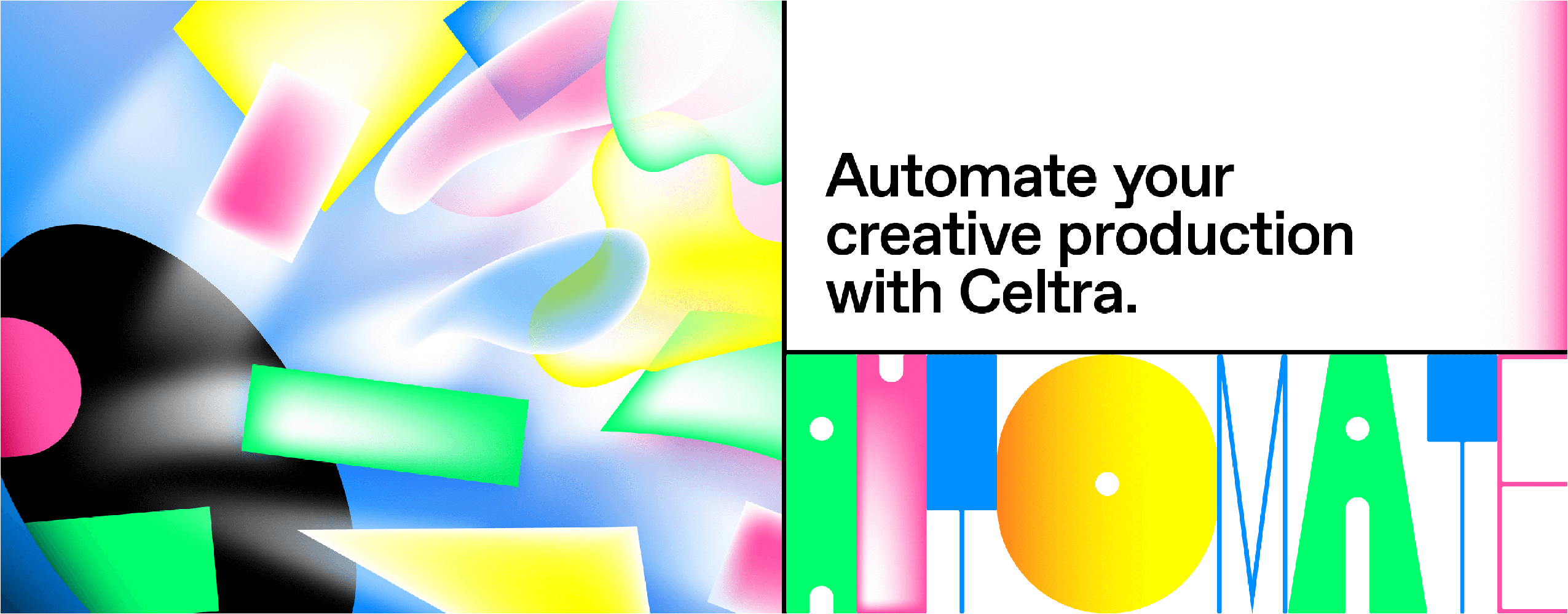
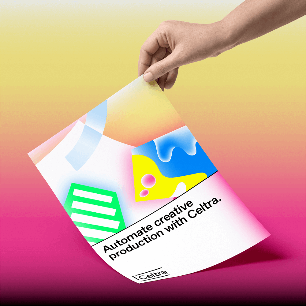
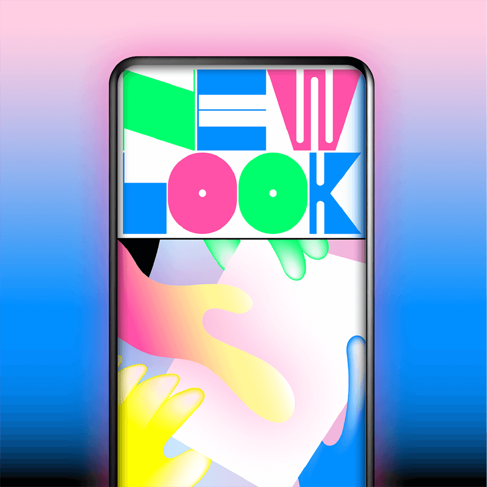
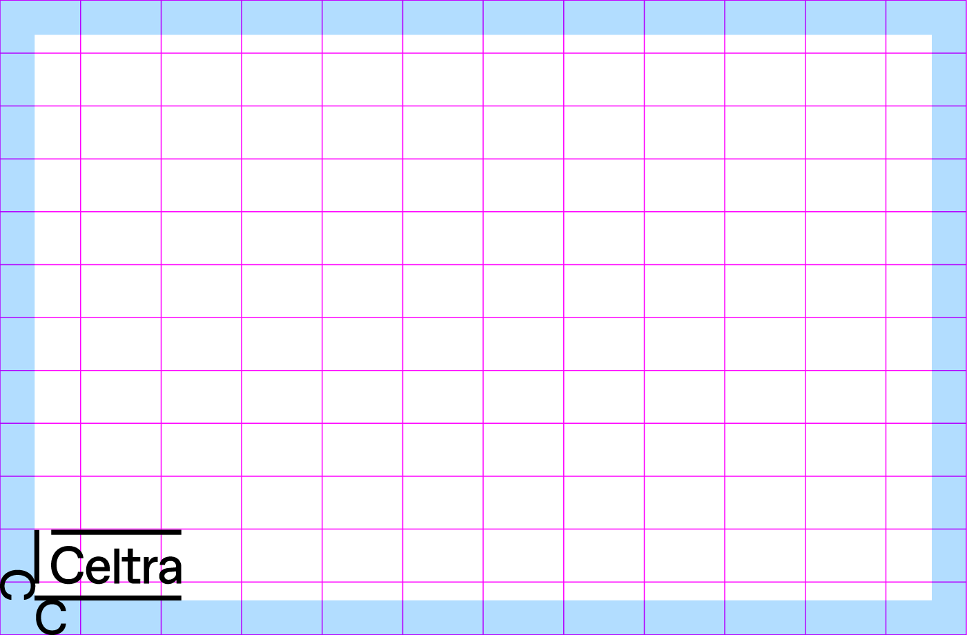
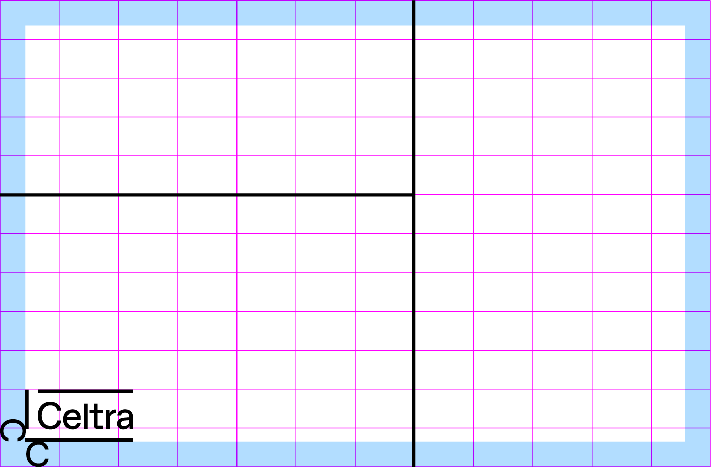
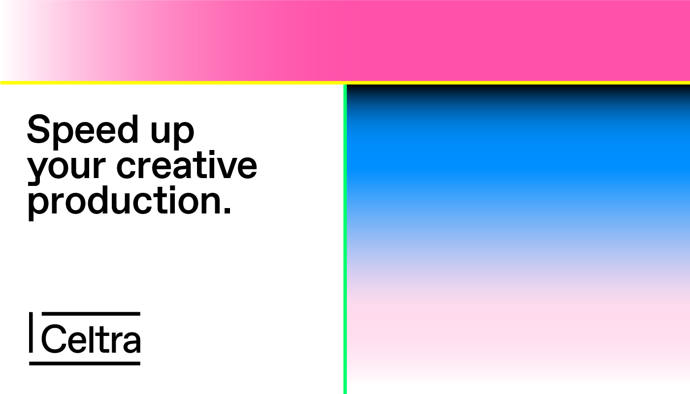
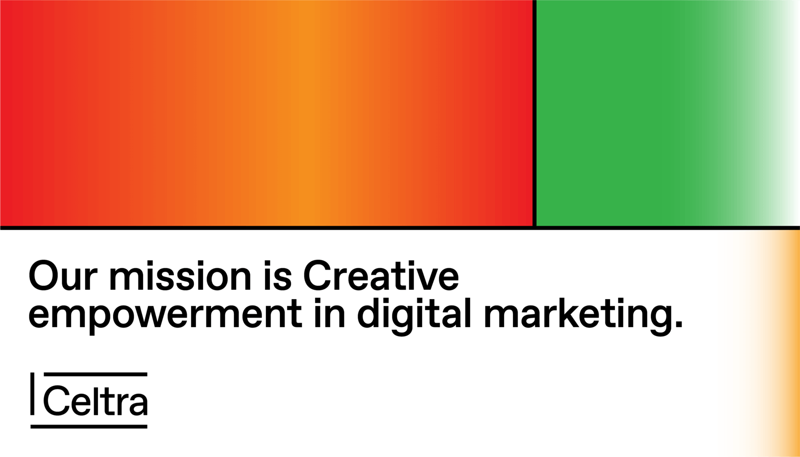
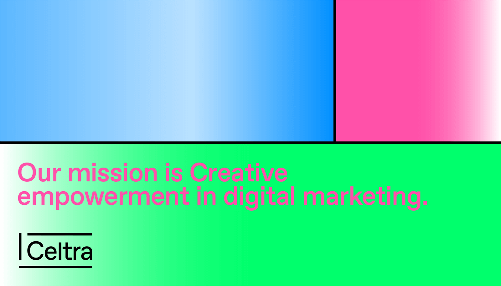
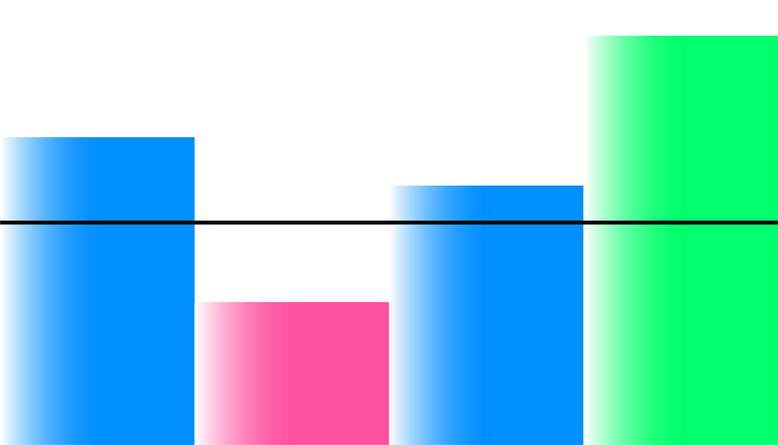
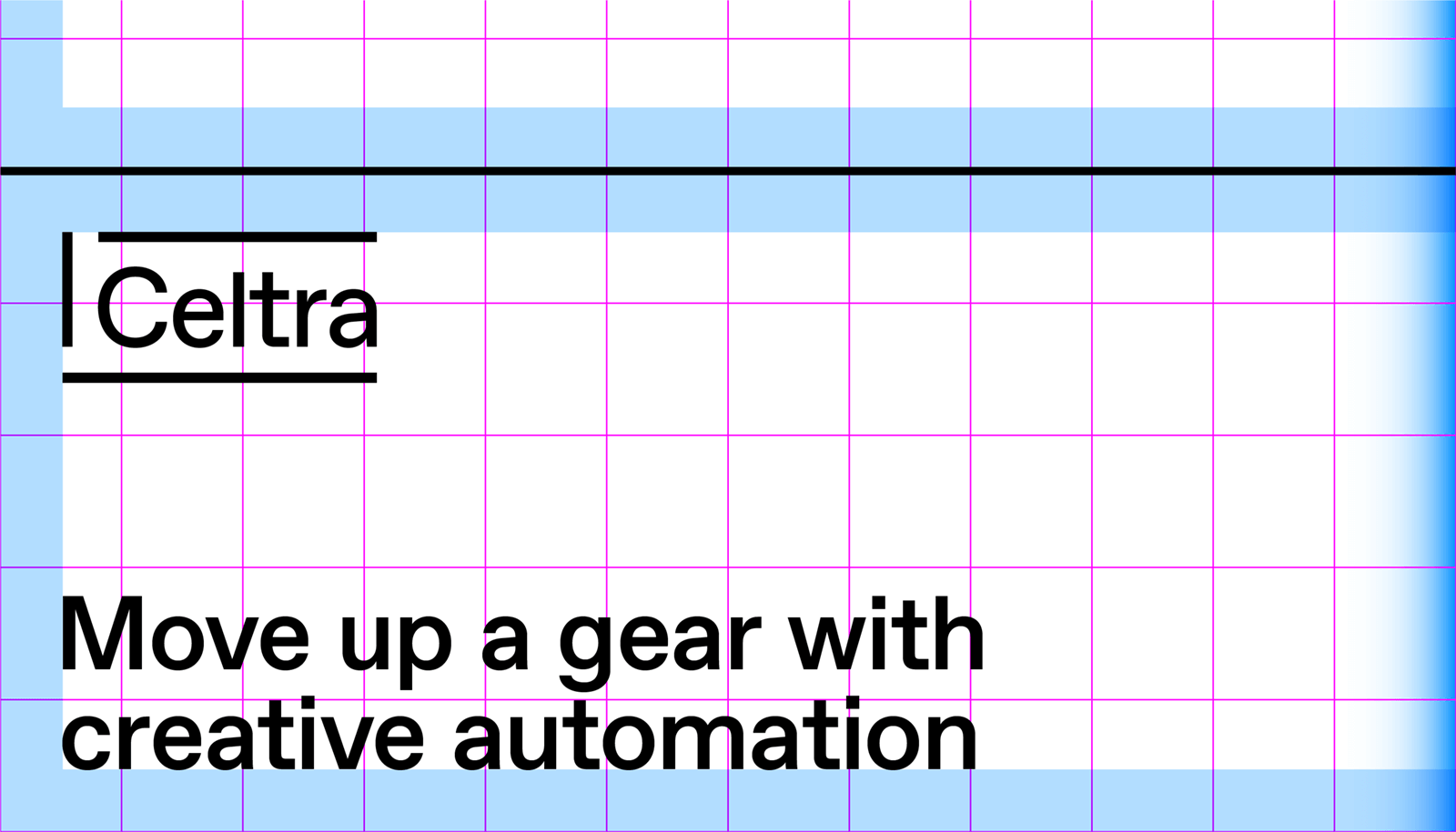
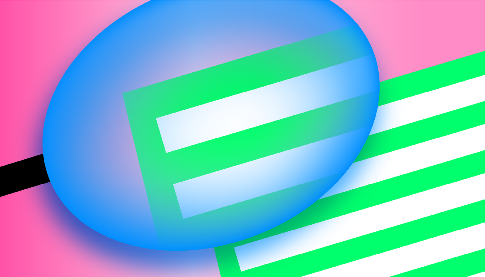
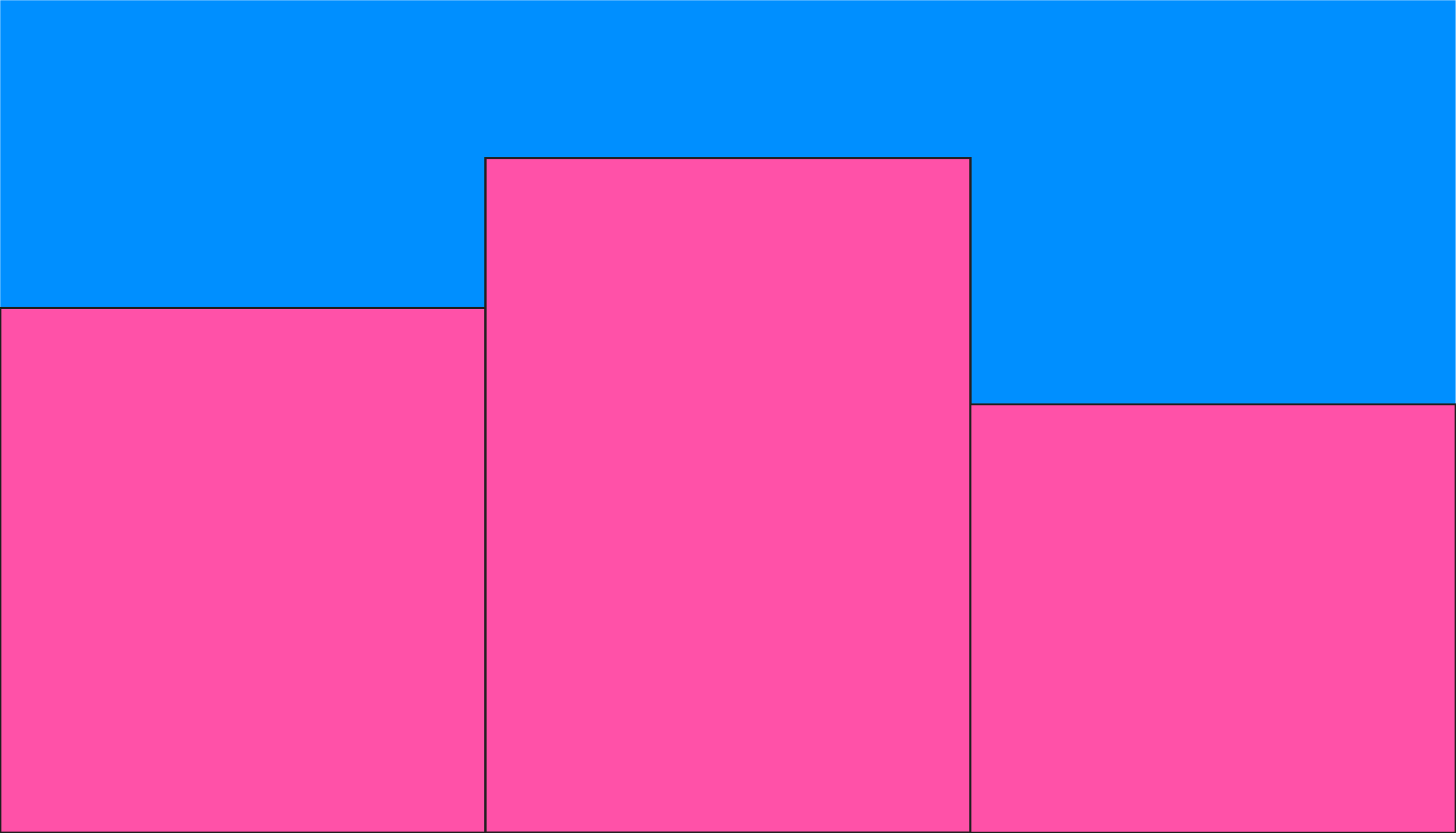
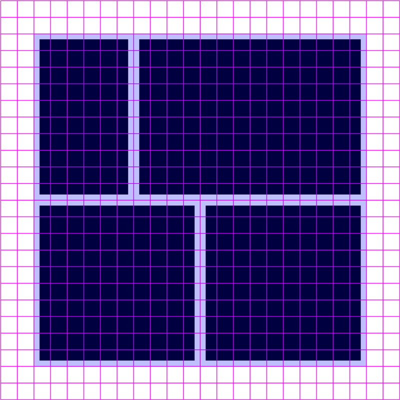
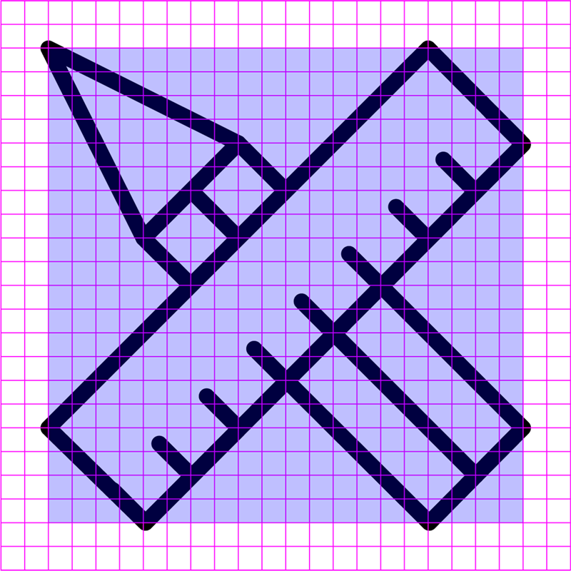
A flexible grid is one of the critical elements of identity.
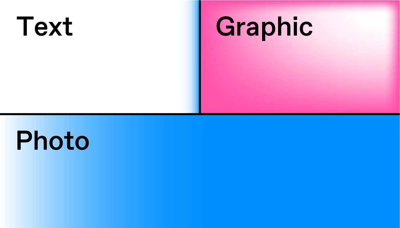
The grid should be kept simple. Its aim is to help you organize content clearly and logically.
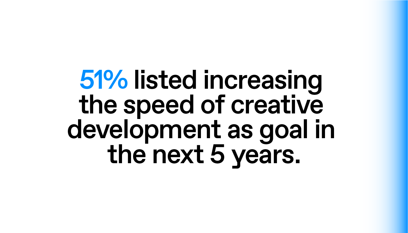
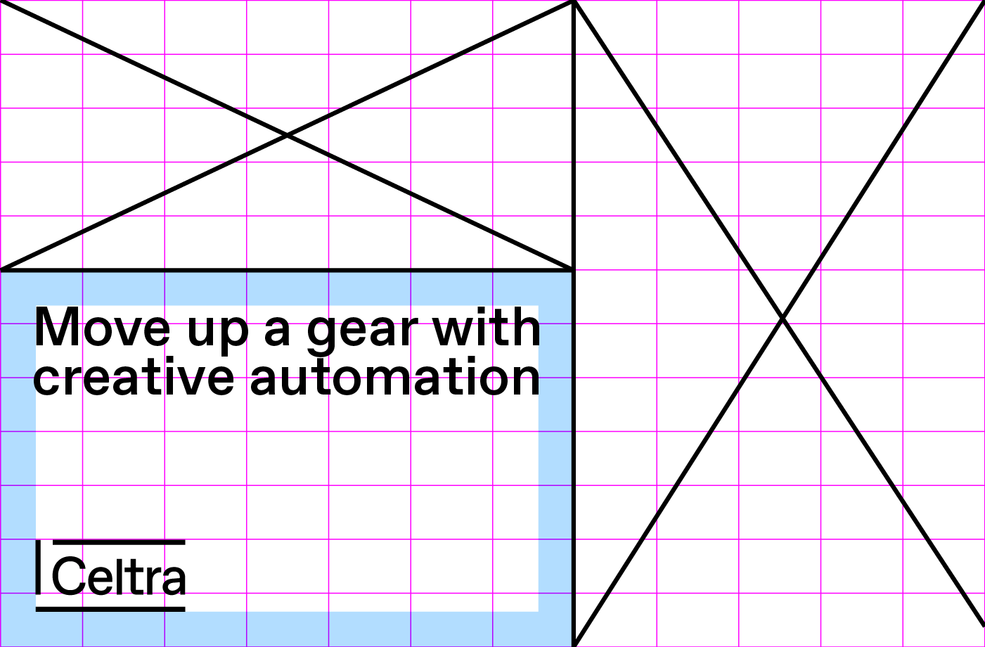
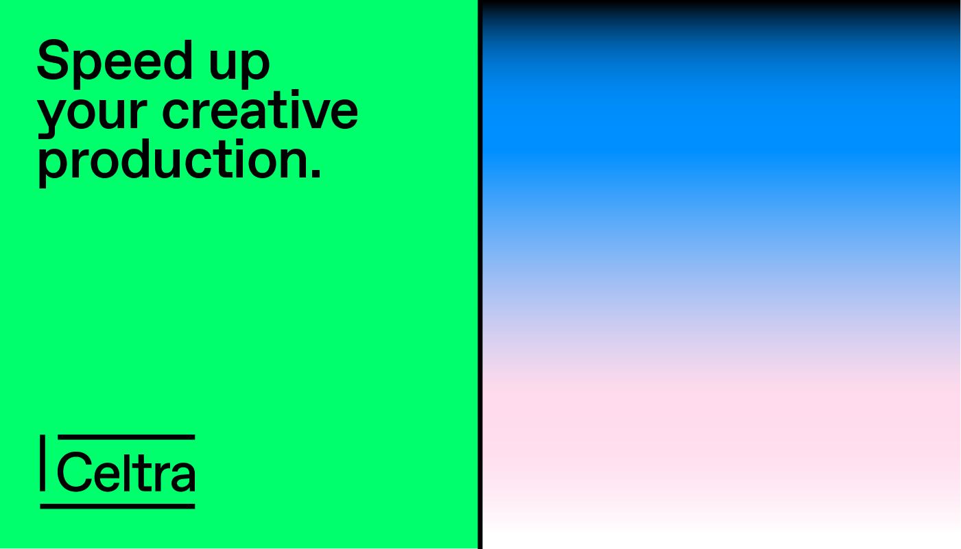
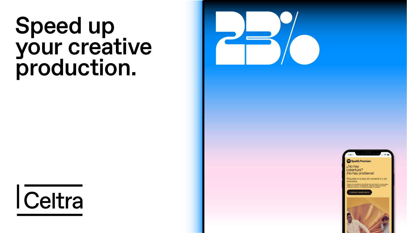
Example: if an ad has a text and a graphic (two elements in total), then the grid should stick to two cells.
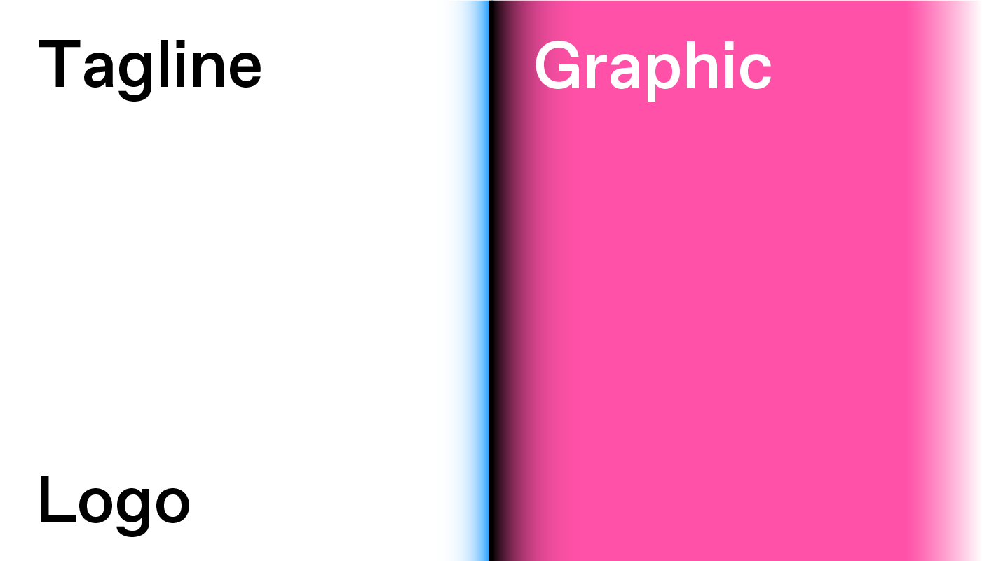
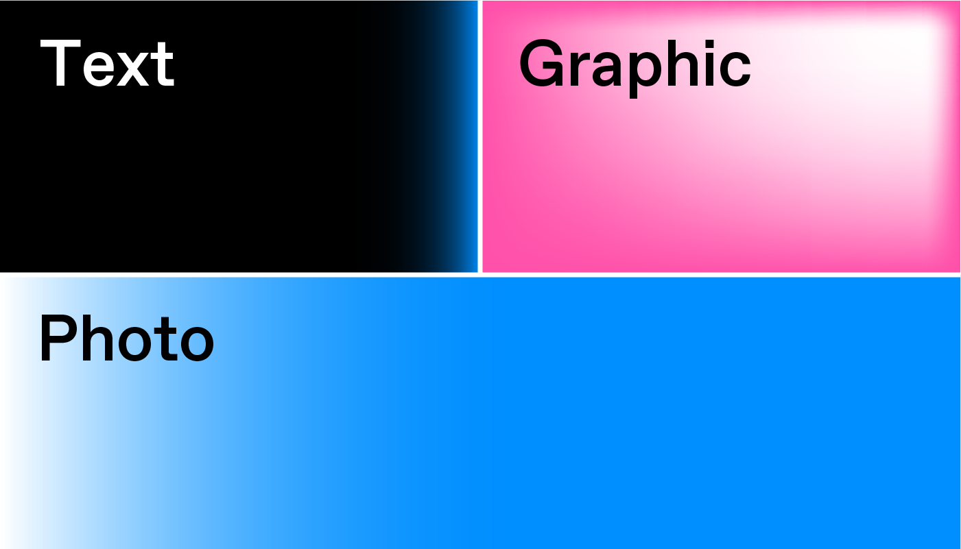
Example: if a photograph is an essential thing to be shown, it should take over the largest grid element.
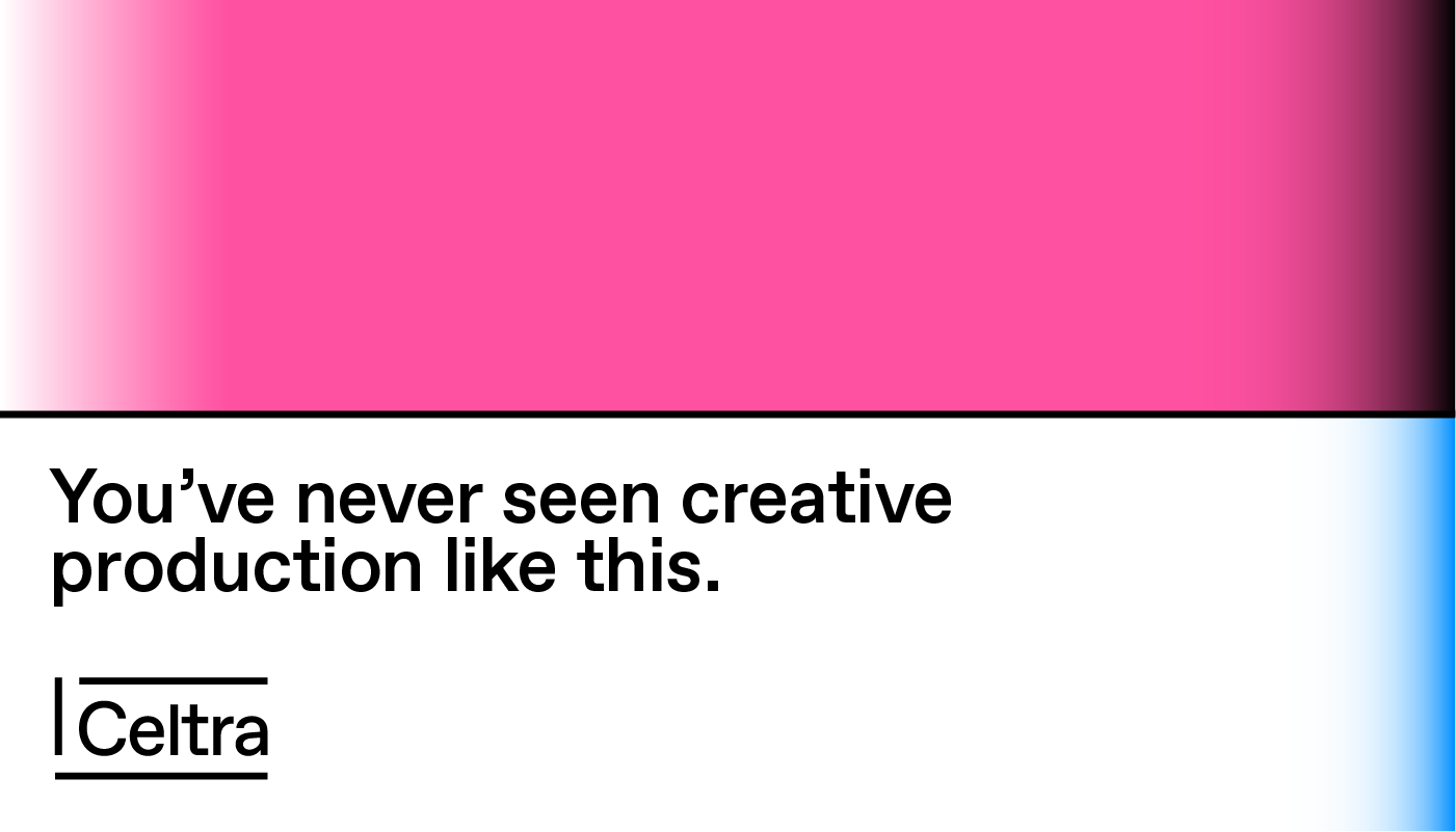
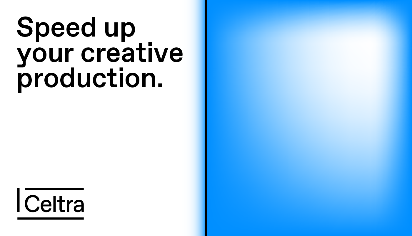
Don’t get too carried away with color. The white space should work as a counterbalance to the vivid visuals in an approximate 1:1 ratio.
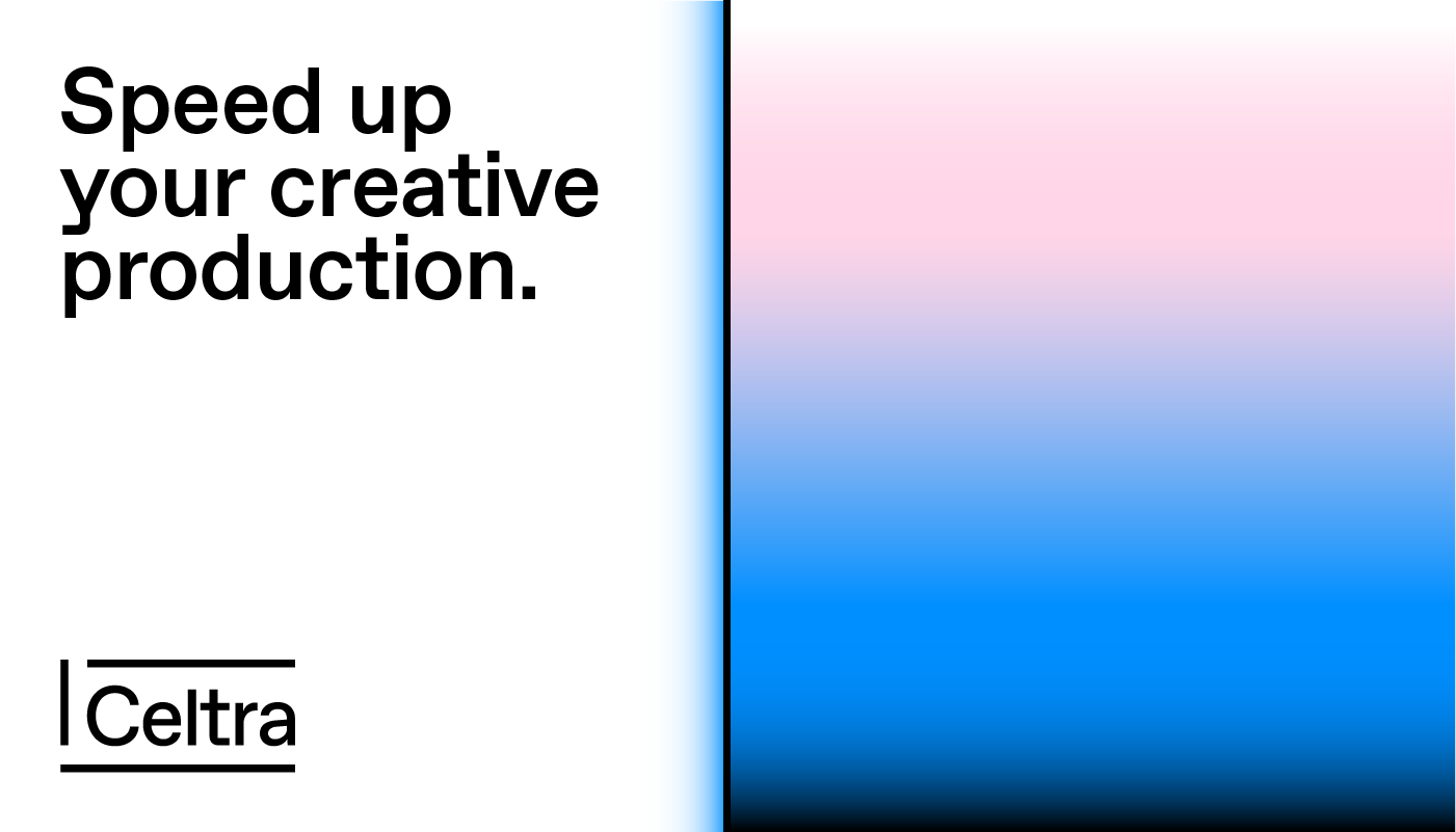
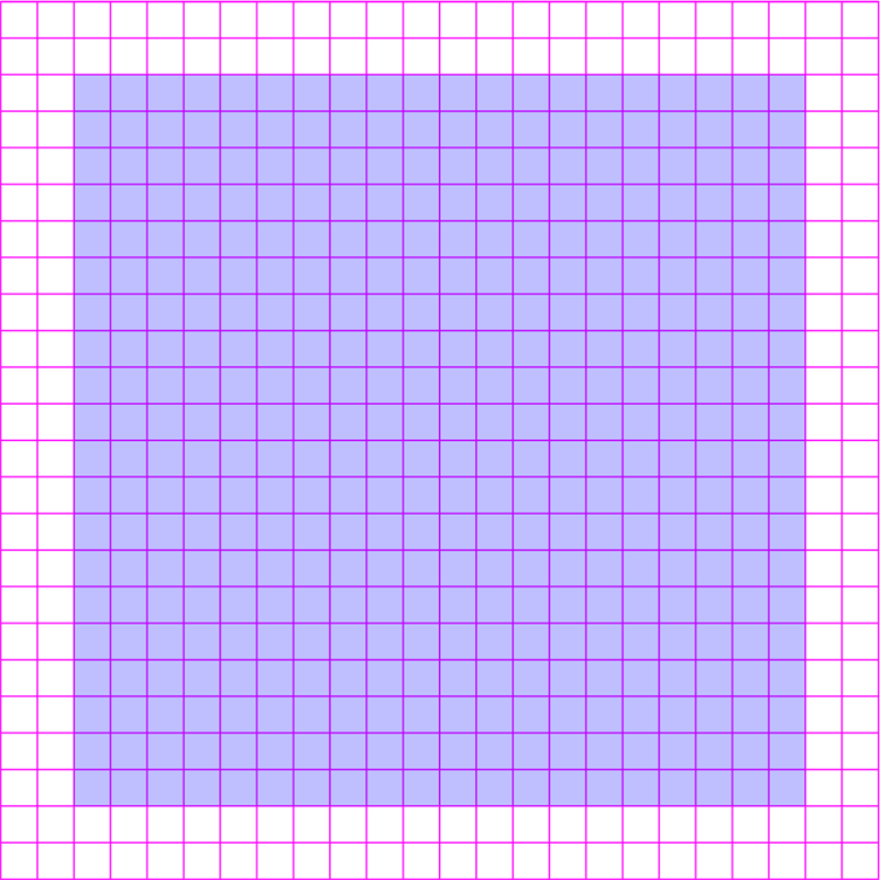
If you don’t have enough room to maneuver or have just one type of content on the application, there’s no need for a grid.
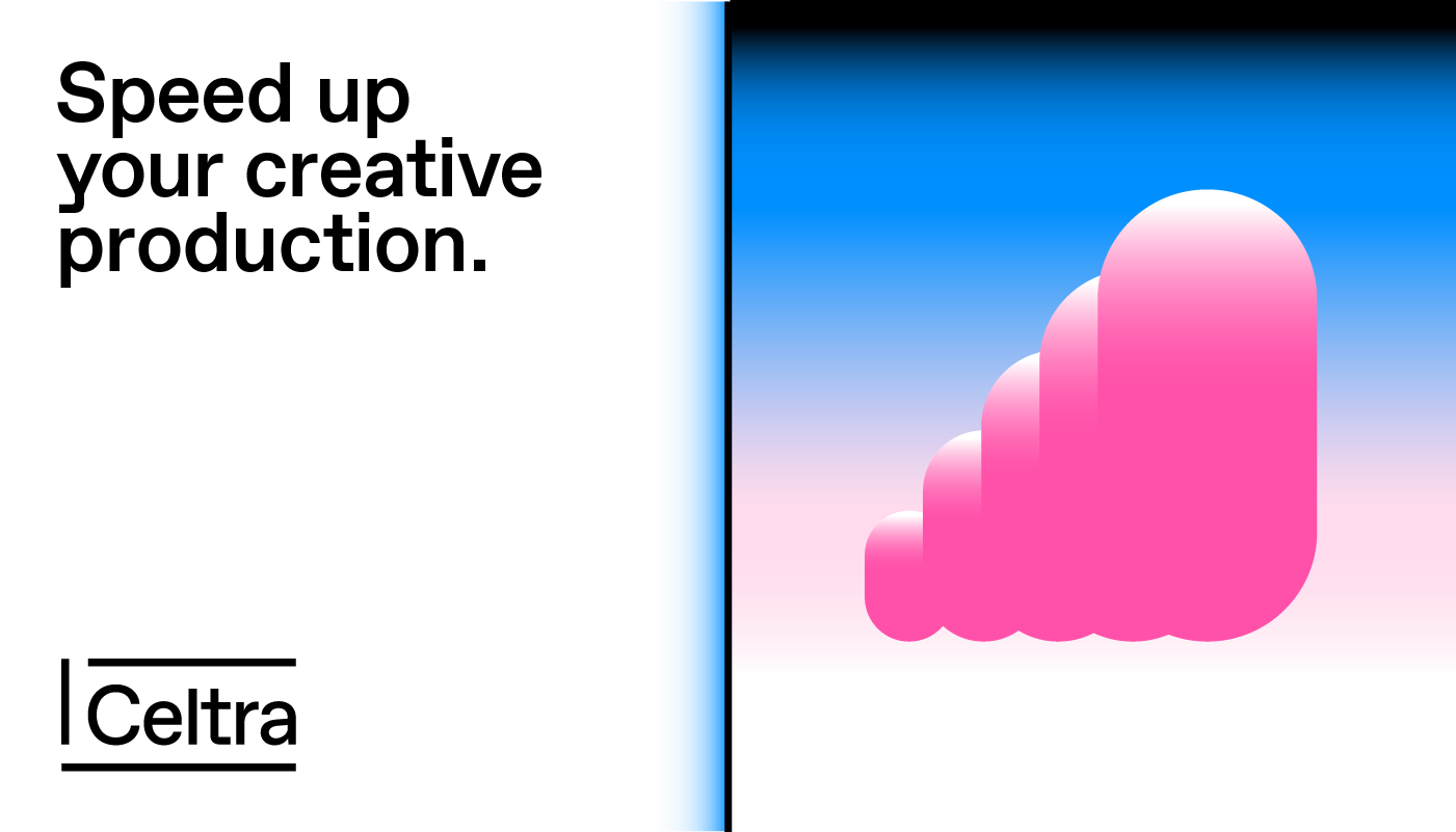
Big is beautiful so go edge to edge, full-bleed. Visual elements should never float in the middle of the cell, surrounded by white space.
No grid
Simple grid
Complex grid
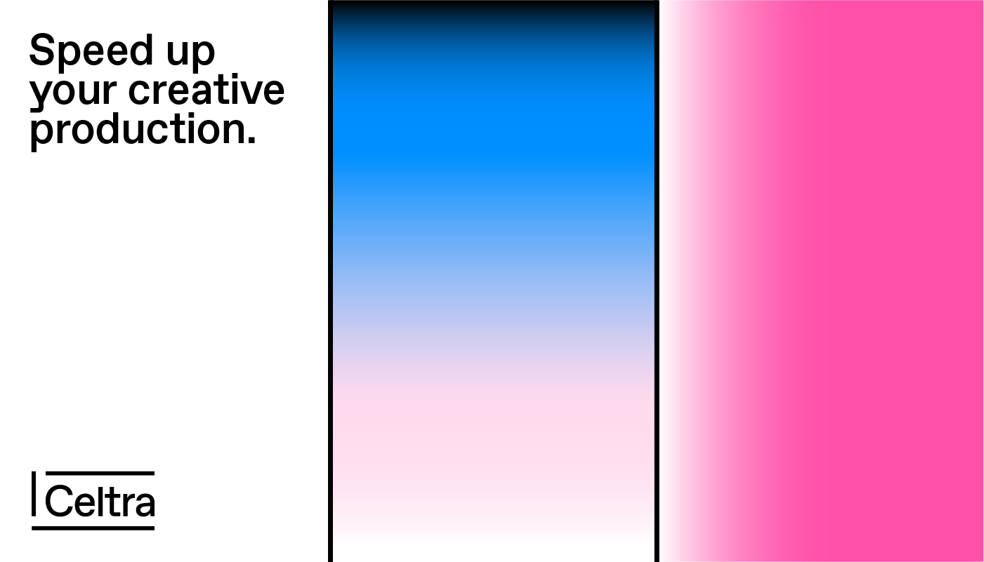
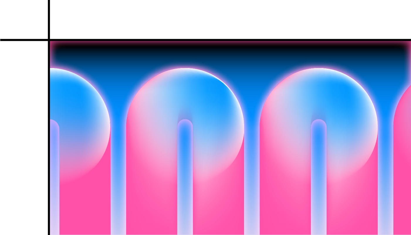
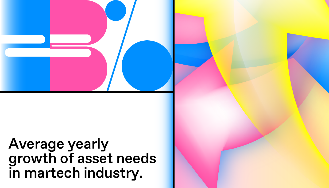
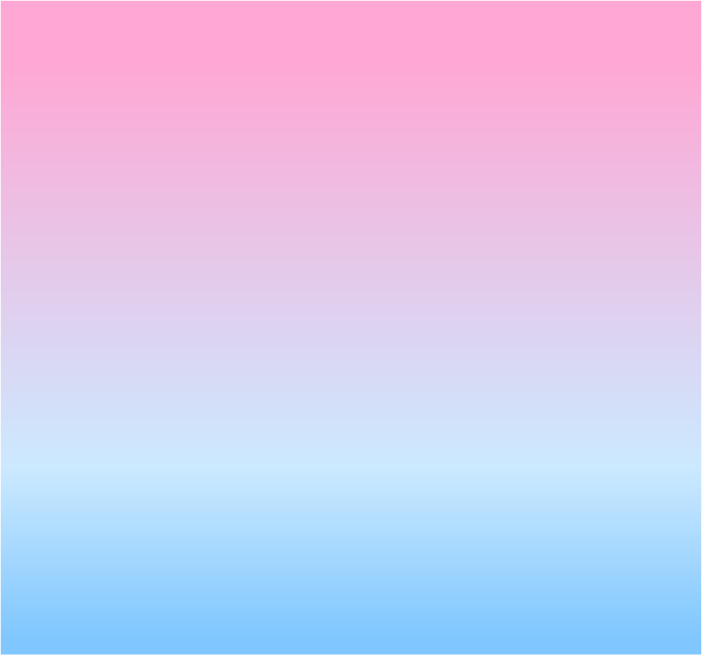
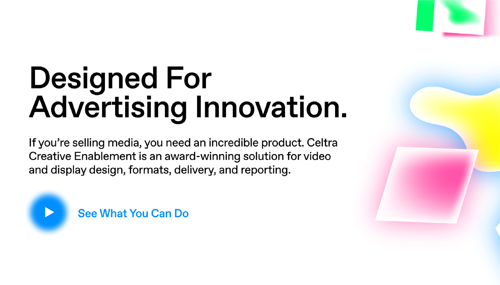
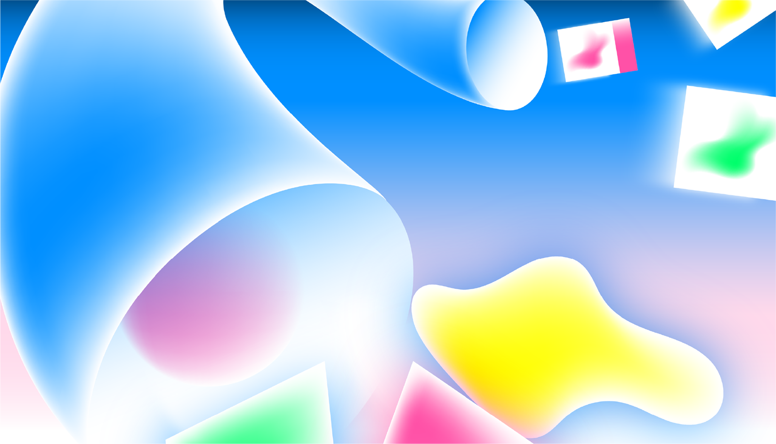
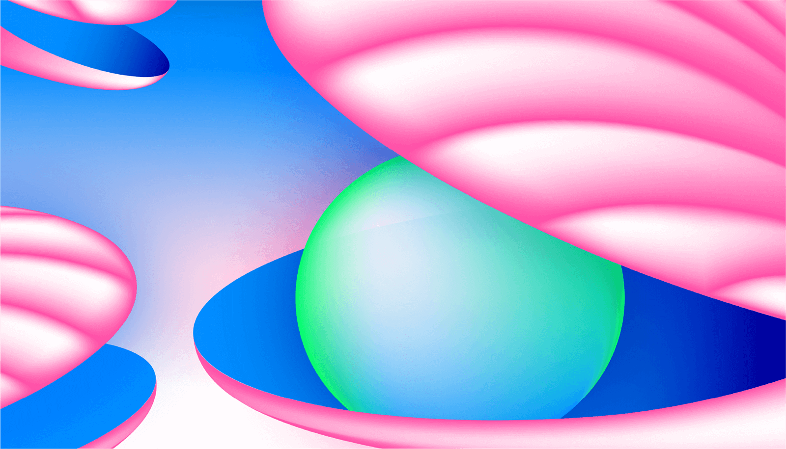
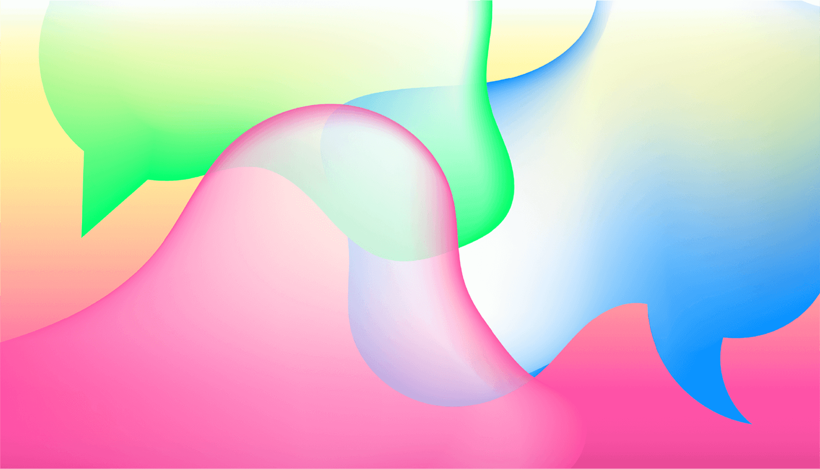
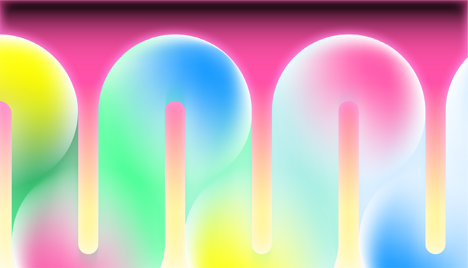
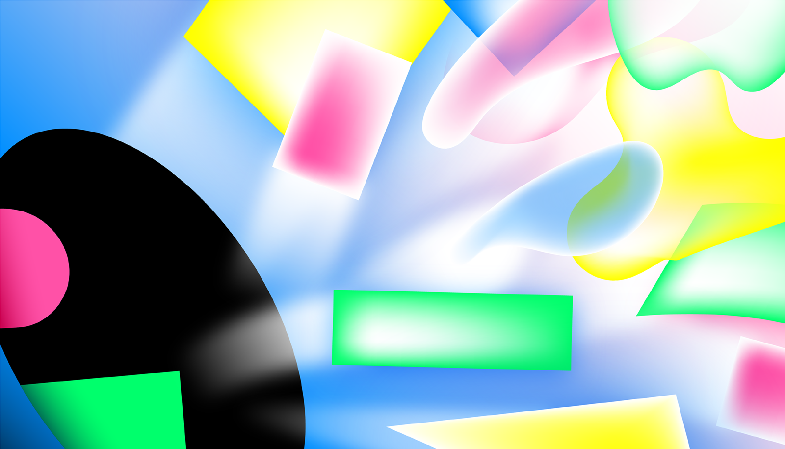
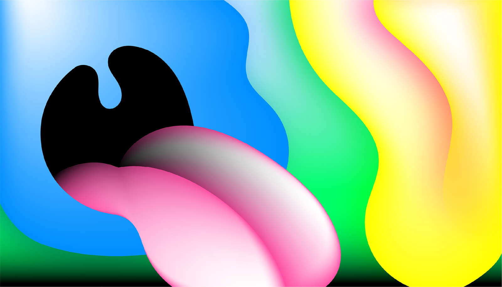
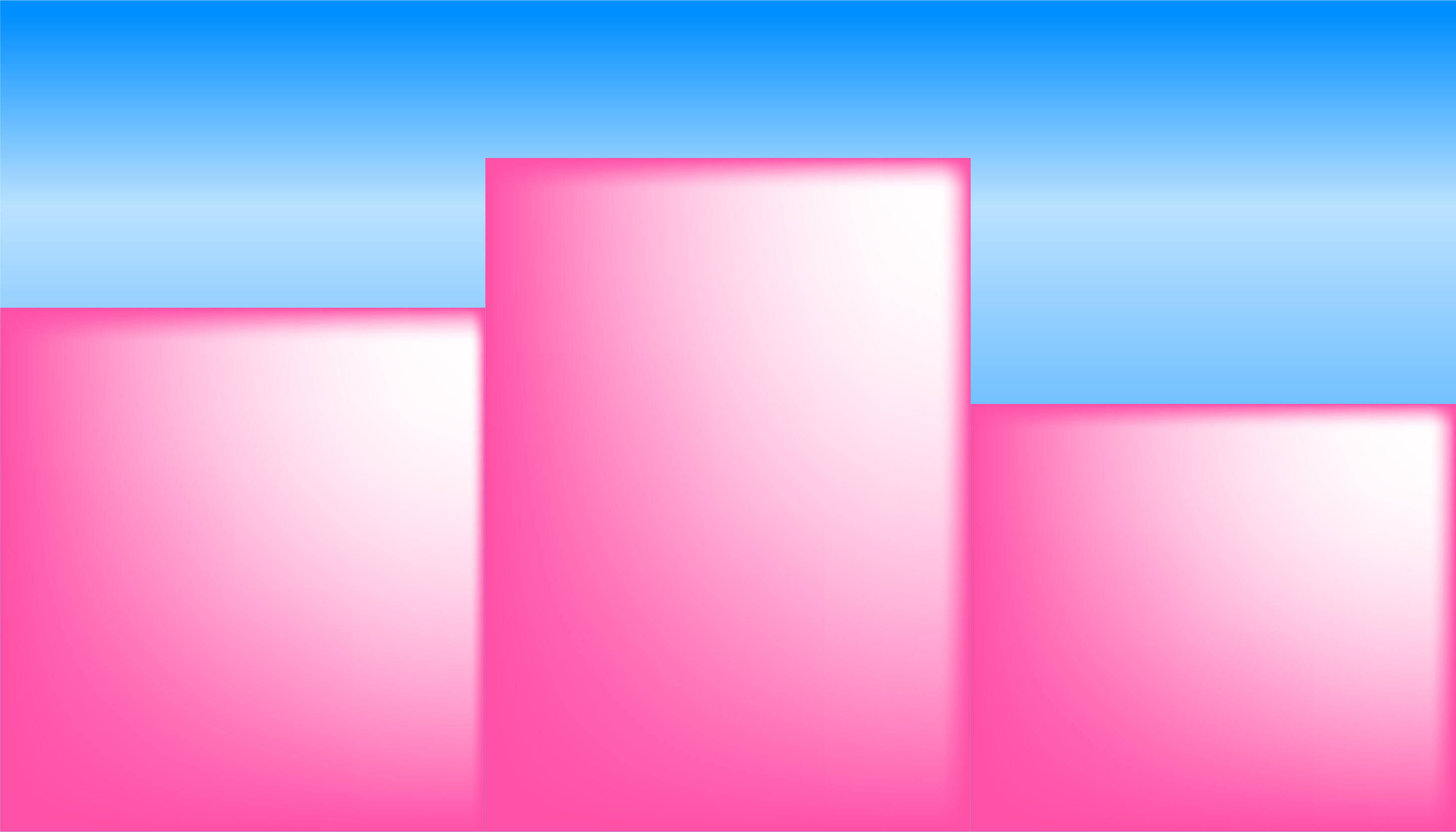
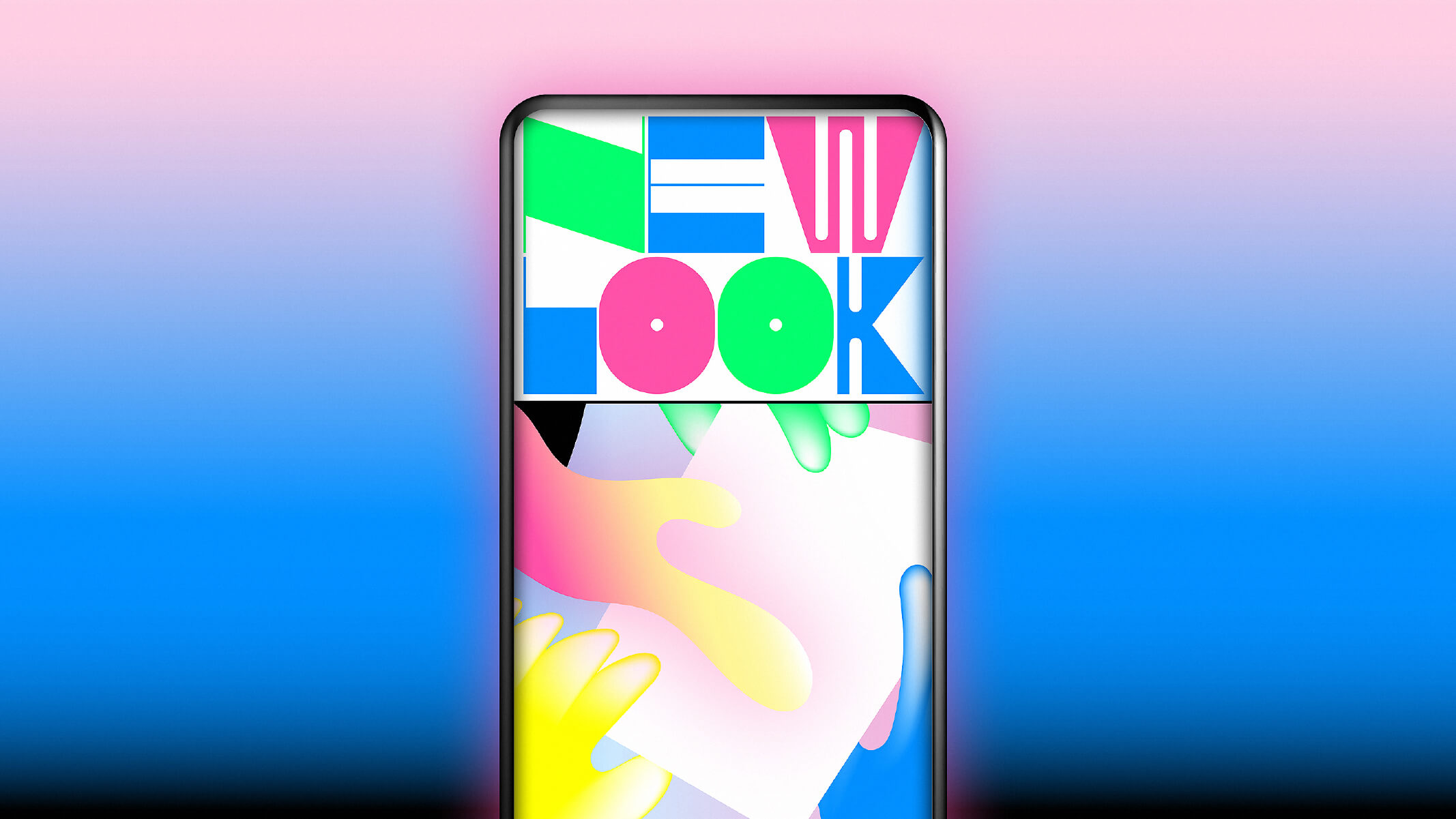
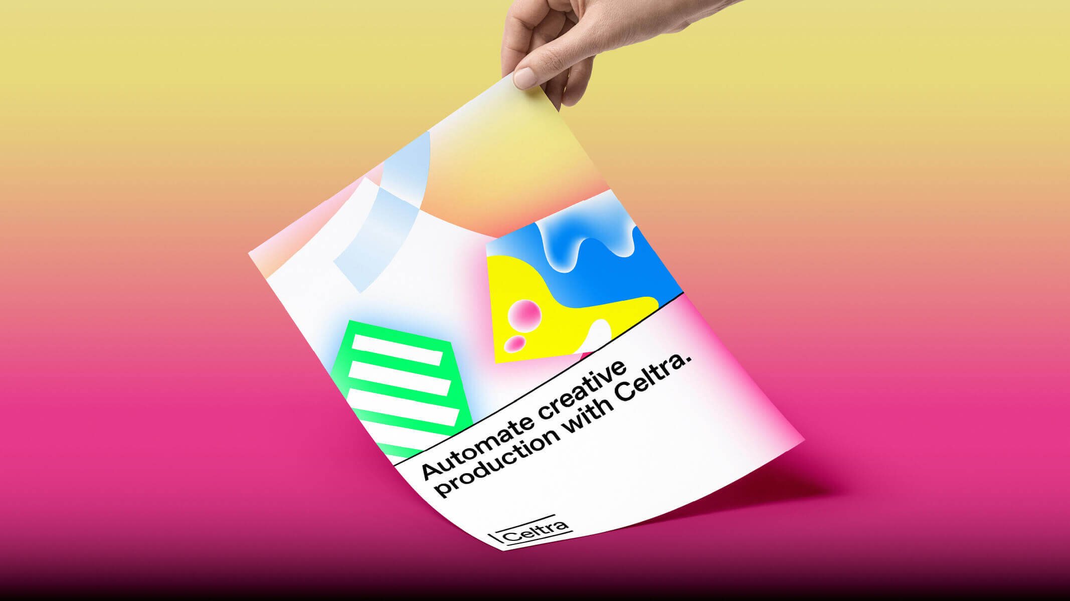
Celtra’s identity utilizes a wide range of colors and gradients. You should use this palette in both functional and surprising ways to create unexpected and bold designs.
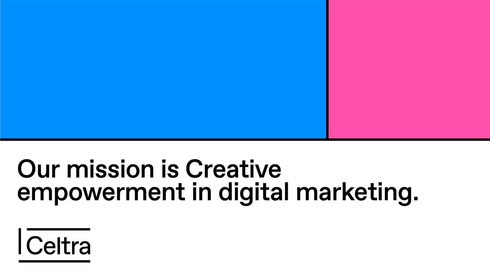
The primary brand colors are Celtra Lollipop Pink and Celtra Candy Blue. They always appear in full tone. When it comes to these colors, there’s no room for DIY - they shouldn’t be darkened, lightened, or displayed transparently.
RGB — 255 81 167
CMYK — 0 100 0 0
Pantone 806
RGB — 0 143 255
CMYK — 100 40 0 0
Pantone Process Cyan
The background color is mainly white or black. But since the world isn’t black and white, the color palette can be extended to include grey tones for functional applications of user interfaces.
RGB — 255 255 255
CMYK — 0 0 0 0
RGB — 0 0 0
CMYK — 0 0 0 100
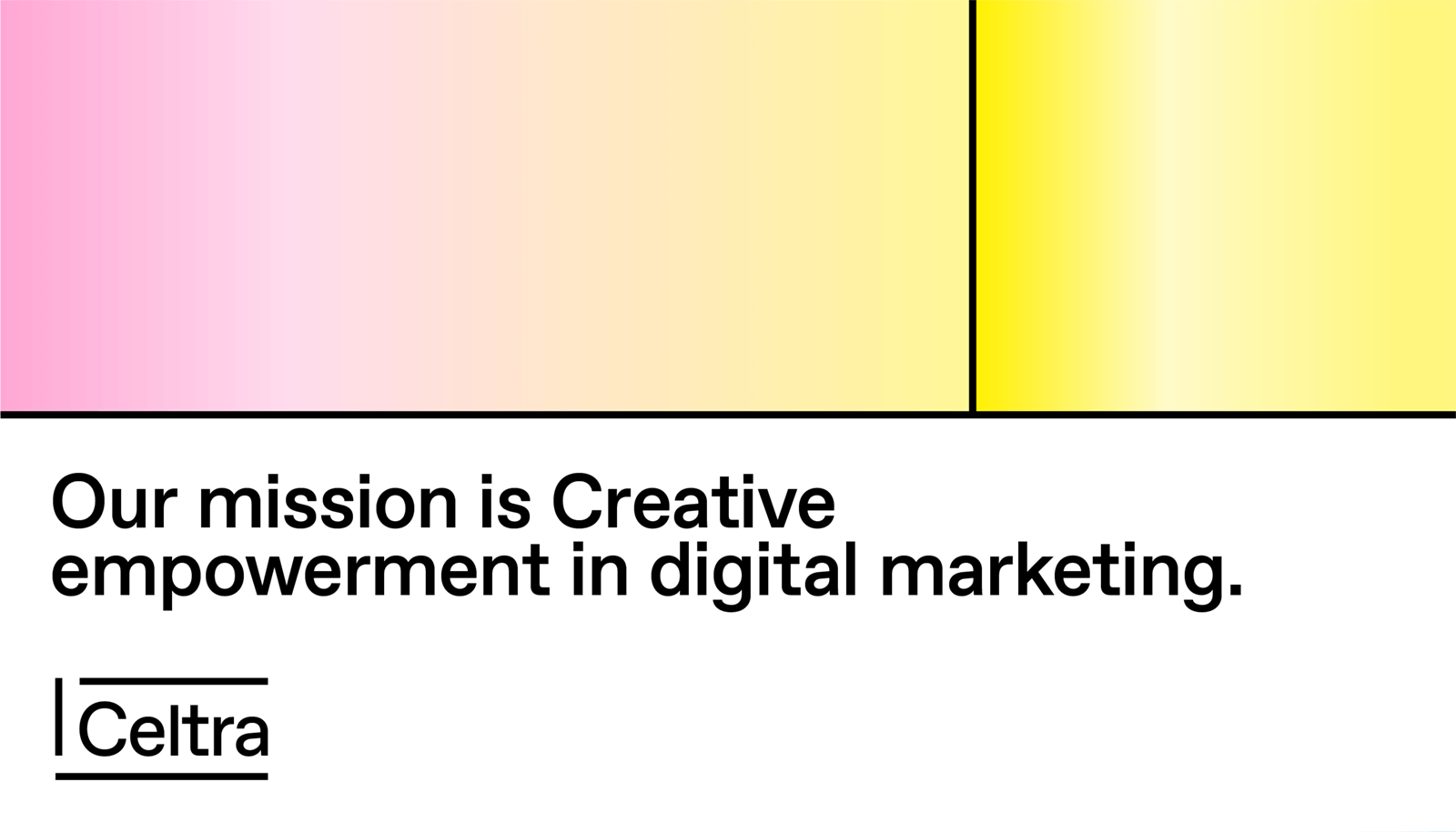
The secondary brand colors are Celtra Lemon Yellow and Celtra Peppermint Green. They should be used sparingly throughout illustration, photography, and product to maintain meaning and potency.
RGB — 255 255 0
CMYK — 6 0 100 0
Pantone Process Yellow
RGB — 0 255 108
CMYK — 50 0 100 0
Pantone 802
These are predefined swatches that derive from primary and secondary colors and are available for download. While you should aim to make the content as dynamic as possible, the look is all about consistency, so however much you’d like to, don’t mix gradient colors on your own.


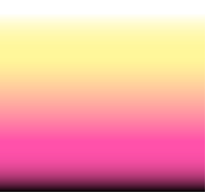

Primarily used for CA applications.

Primarily used for CE applications.
A short gradient finish on the main text background establishes the recognizability of Celtra’s language even on the smallest of materials. It should be used when possible, with the following settings.


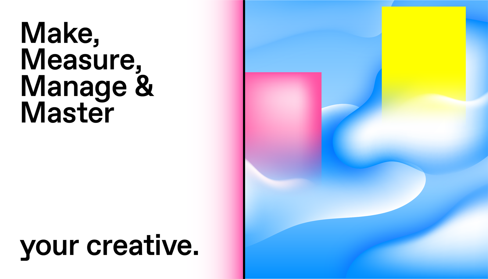
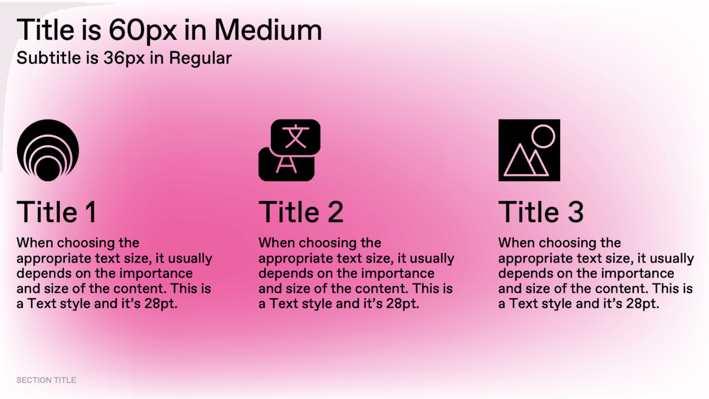
We aim for clear and exciting typographic structures to enable consistent visual communication across all media.
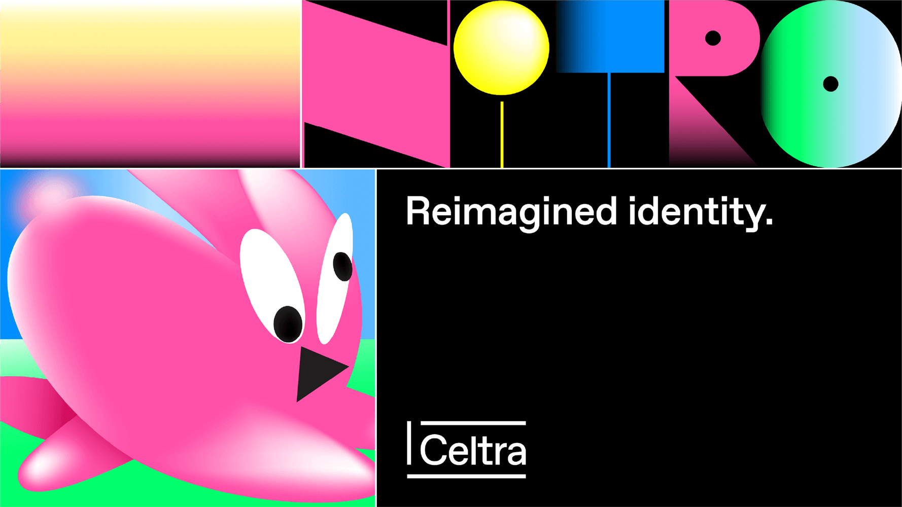
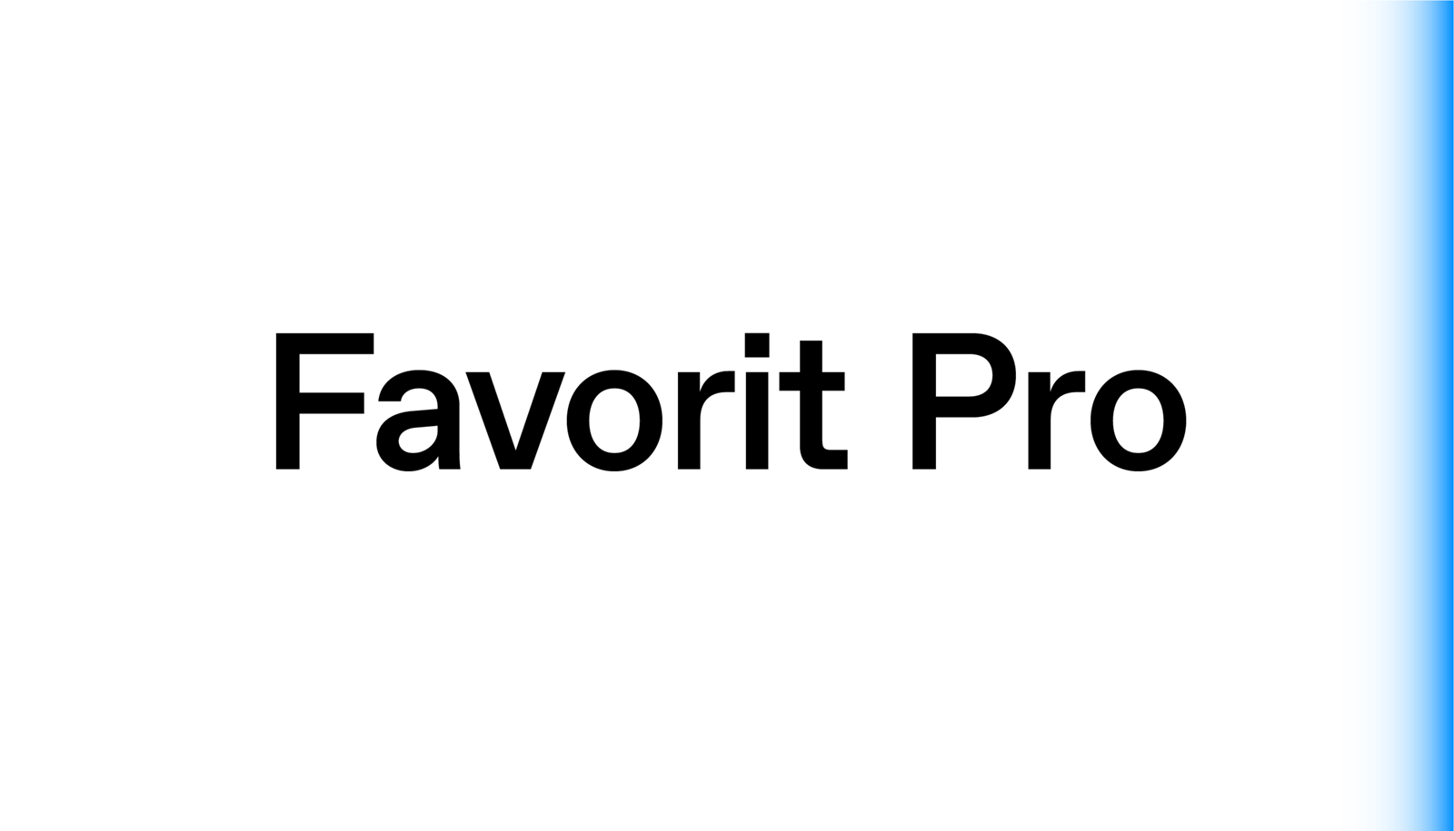
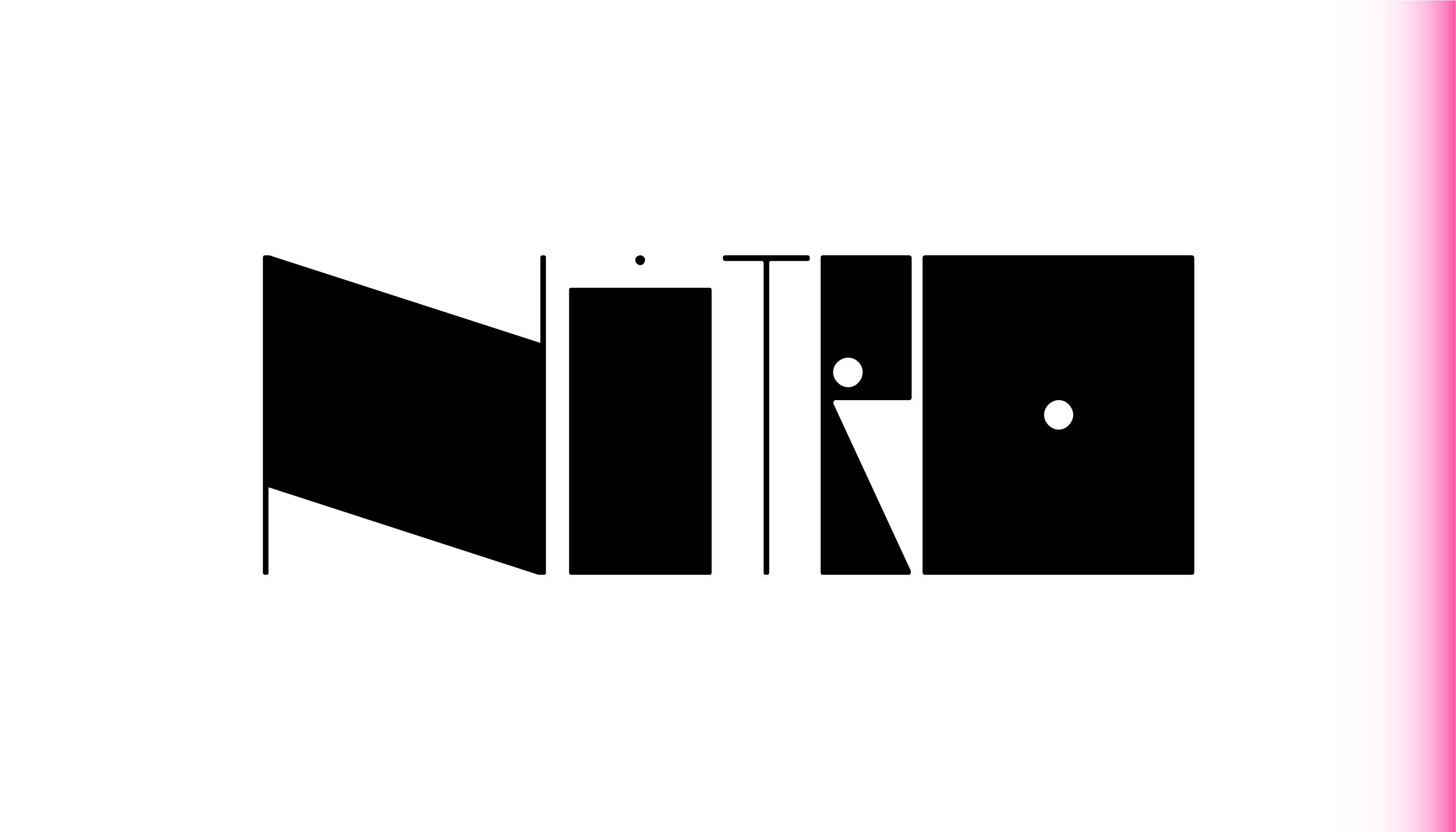
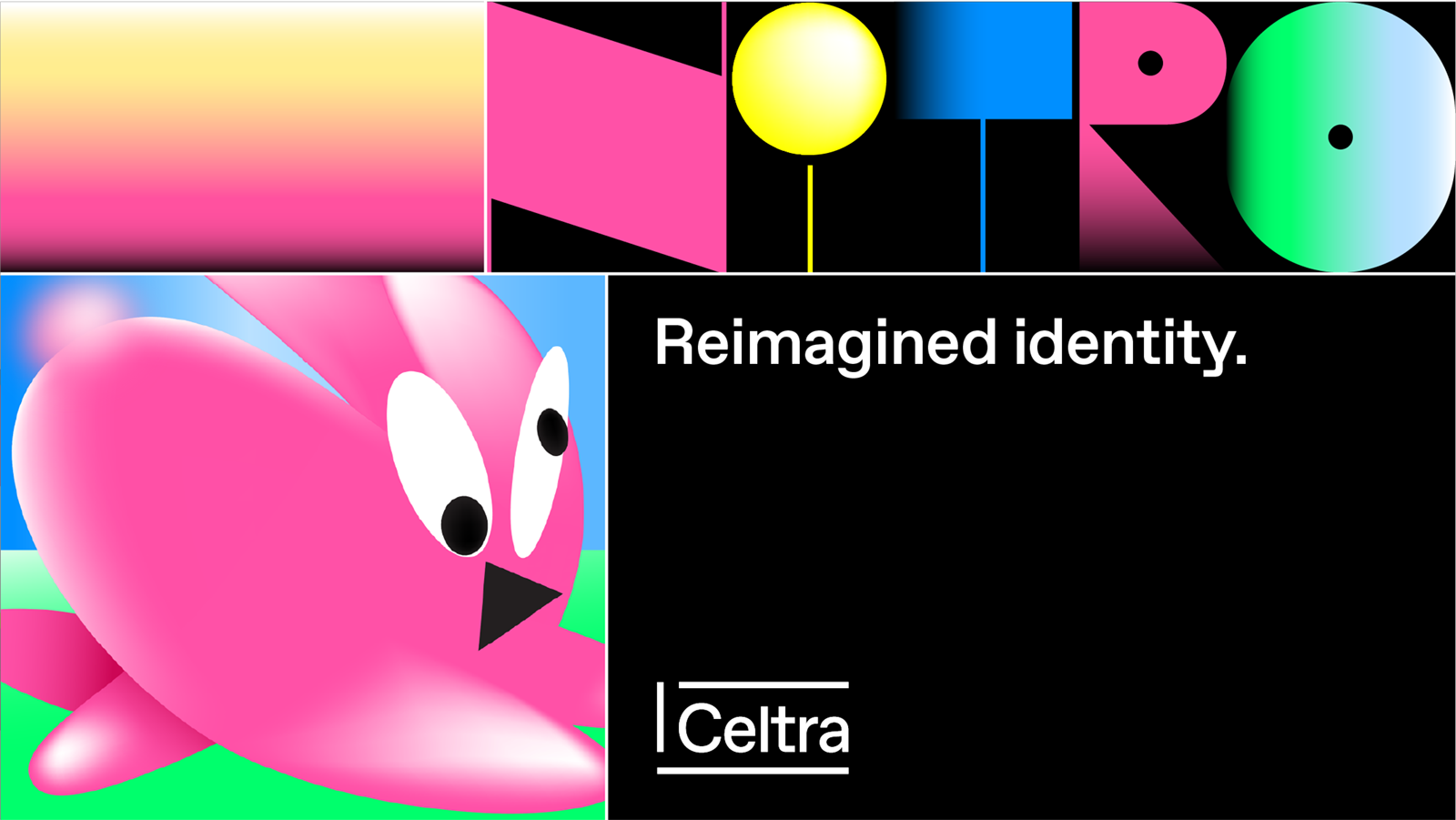
Favorit is the most widely used font of Celtra. Nitro is used for external communication and works as a graphic. It should never be used for full sentences - just highlights and titles. Helvetica is used for quick presentations, Google Docs, and other situations where Favorit isn’t available.
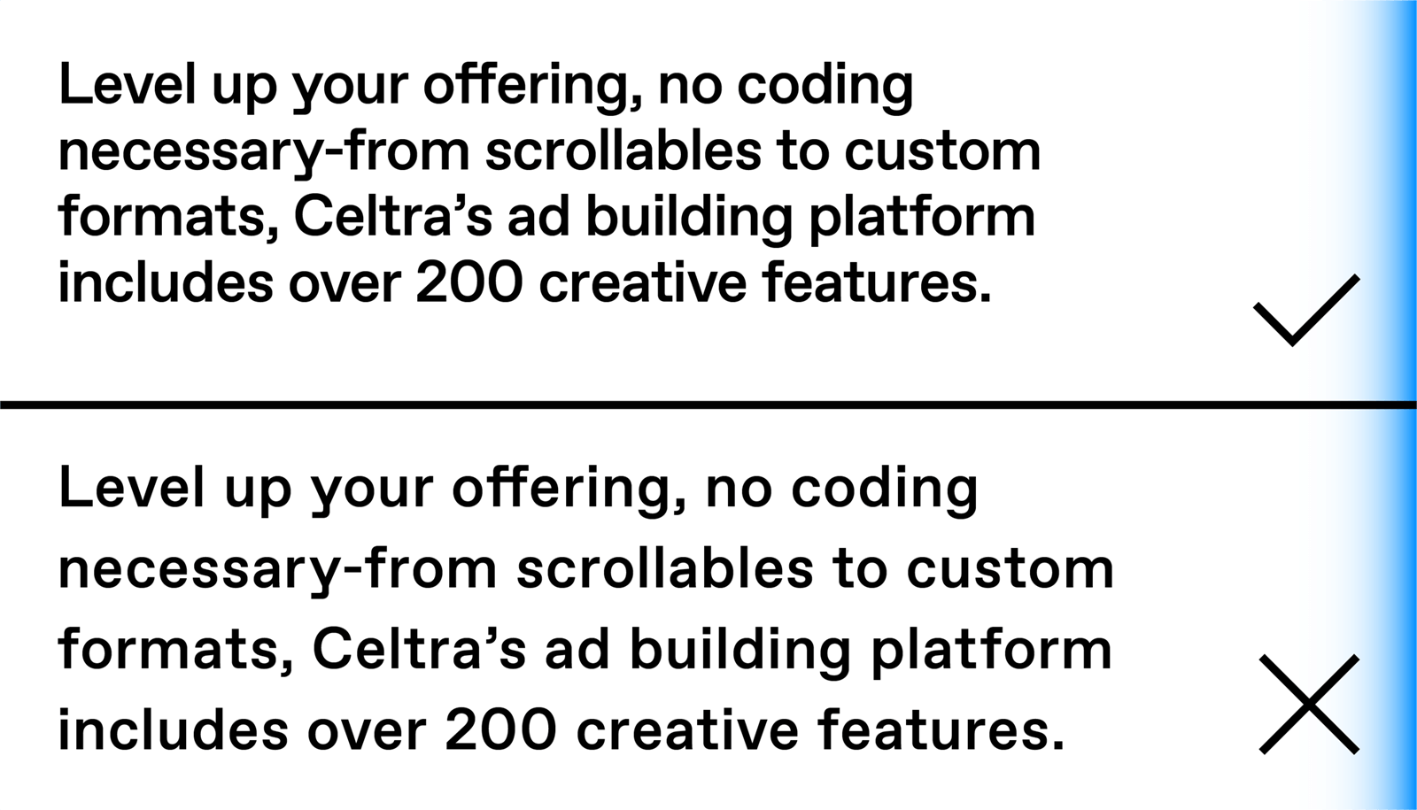
There are right ways and wrong ways to mix and match. Consistent type pairings bring clarity, consistency, and hierarchy to all communication materials.
Title Big
Favorit Pro Medium
font-size: 4.0rem;
line-height: 3.75rem;
letter-spacing: -1px;
Title
Favorit Pro Medium
font-size: 3.5rem;
line-height: 3.4rem;
letter-spacing: -1px;
Heading Big
Favorit Pro Medium
font-size: 3.0rem;
line-height: 2.9rem;
letter-spacing: -1px;
Heading
Favorit Pro Medium
font-size: 2.5rem;
line-height: 2.5rem;
letter-spacing: -1px;
Heading Small
Favorit Pro Medium
font-size: 2.0rem;
line-height: 2.0rem;
letter-spacing: -1px;
Text Big
Favorit Pro Regular
font-size: 1.5rem;
line-height: 1.75rem;
letter-spacing: 0px;
Text
Favorit Pro Regular
font-size: 1.25rem;
line-height: 1.5rem;
letter-spacing: 0px;
Text Small
Favorit Pro Regular
font-size: 1.0rem; (usually set to 16px)
line-height: 1.25rem;
letter-spacing: 0px;
Text Micro
Favorit Pro Regular
font-size: 0.75rem;
line-height: 1.0rem;
letter-spacing: 0px;
The hierarchical system that helps us achieve a consistent brand experience all around.
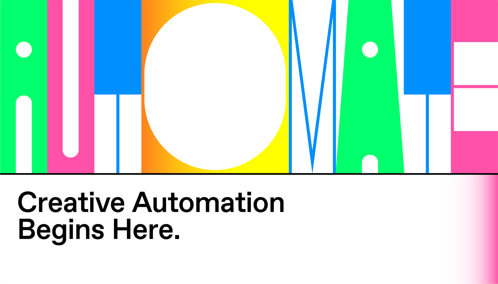
Nitro is a variable custom display font for external communication. Variable fonts significantly reduce the size of your font files, offer the option to adjust the height, width, and contrast of the individual characters, and make it possible to animate your font characters. It can be used in any graphic software, as well as the web.
to imagery and color
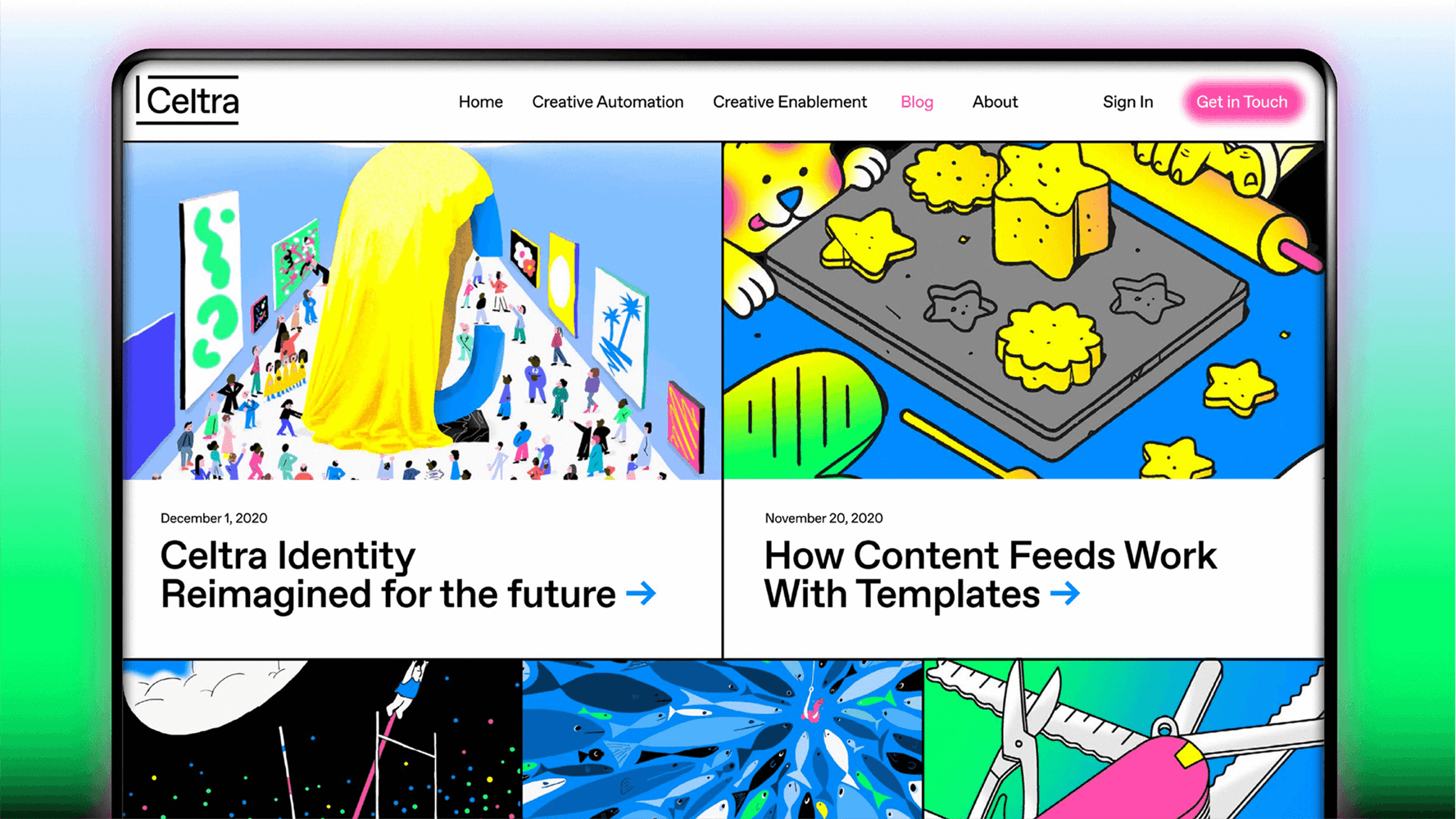
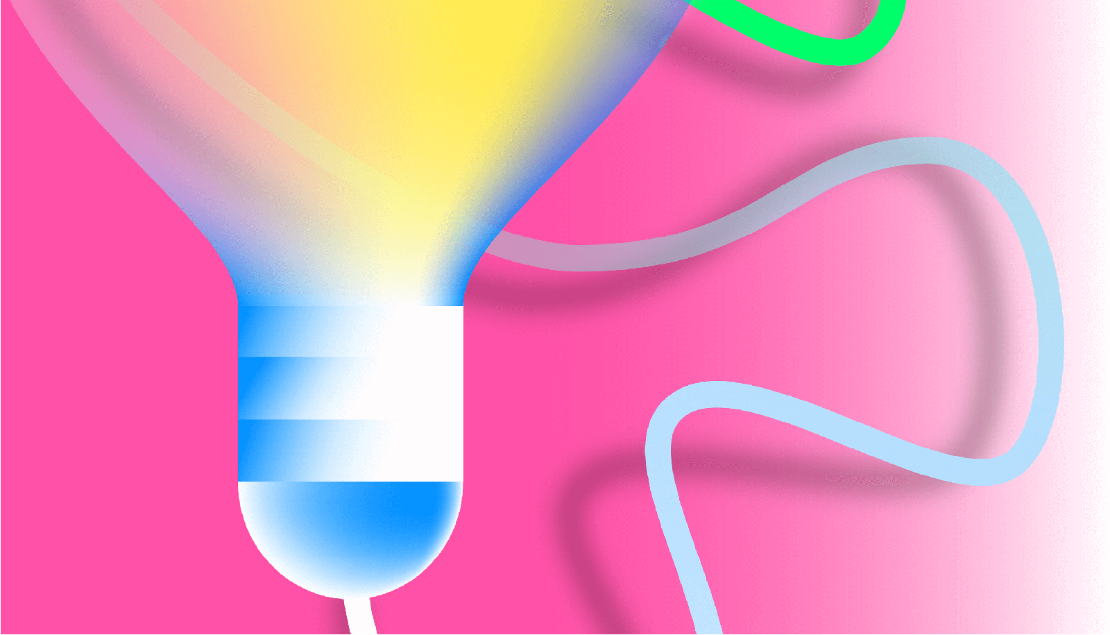
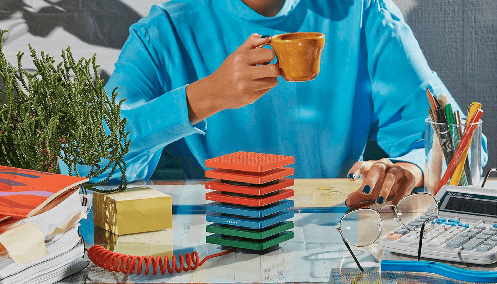
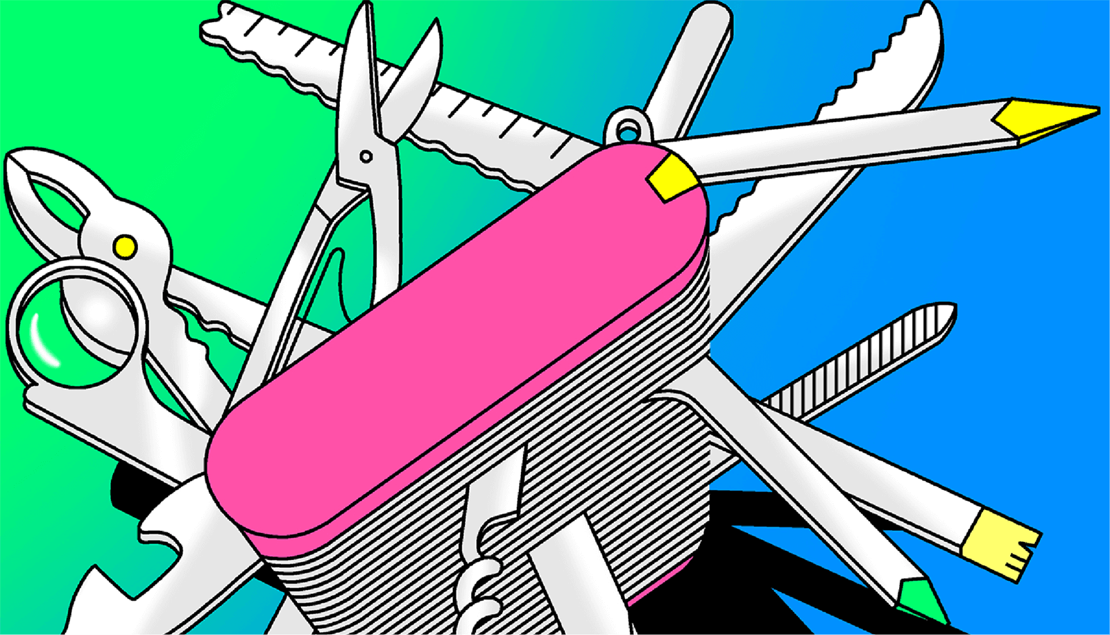
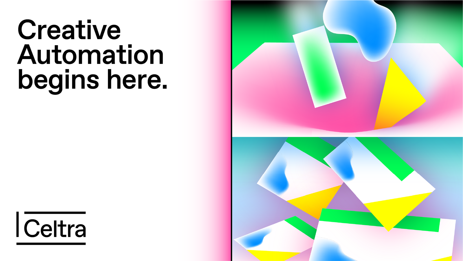
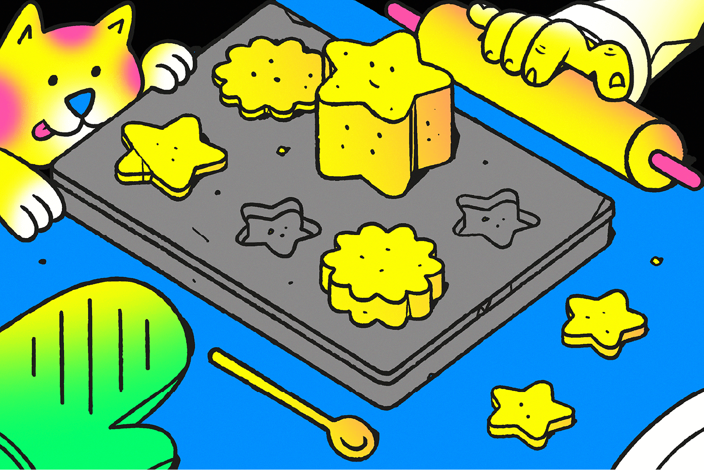
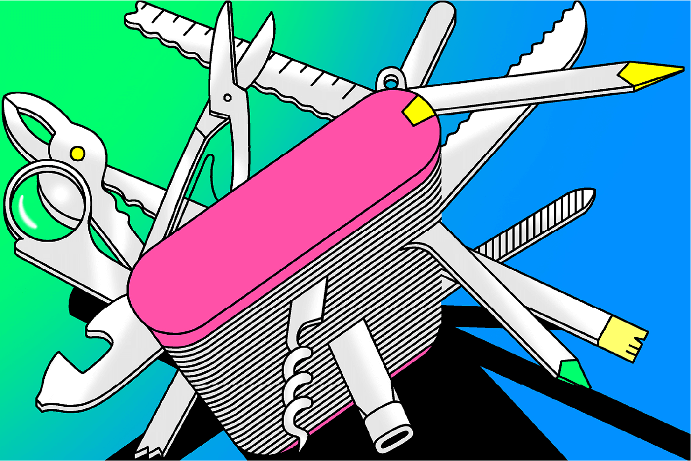
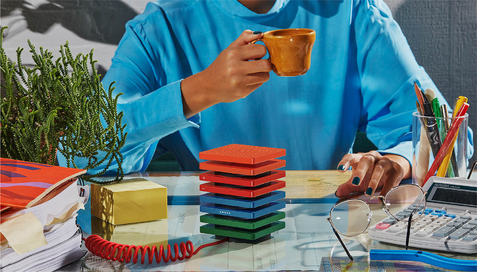
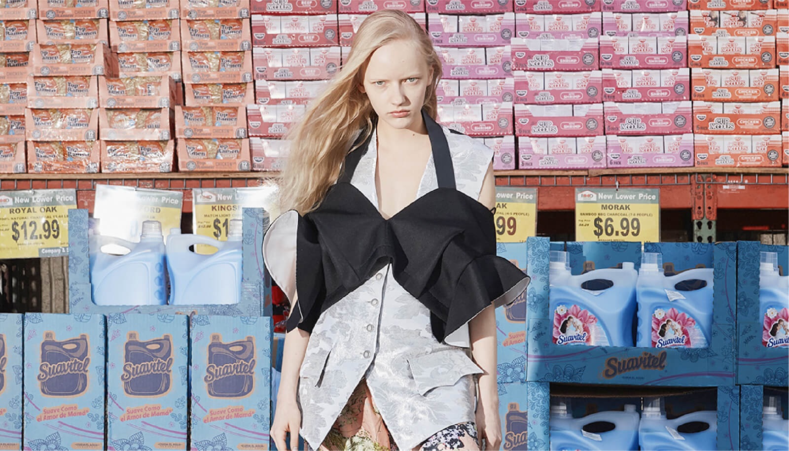
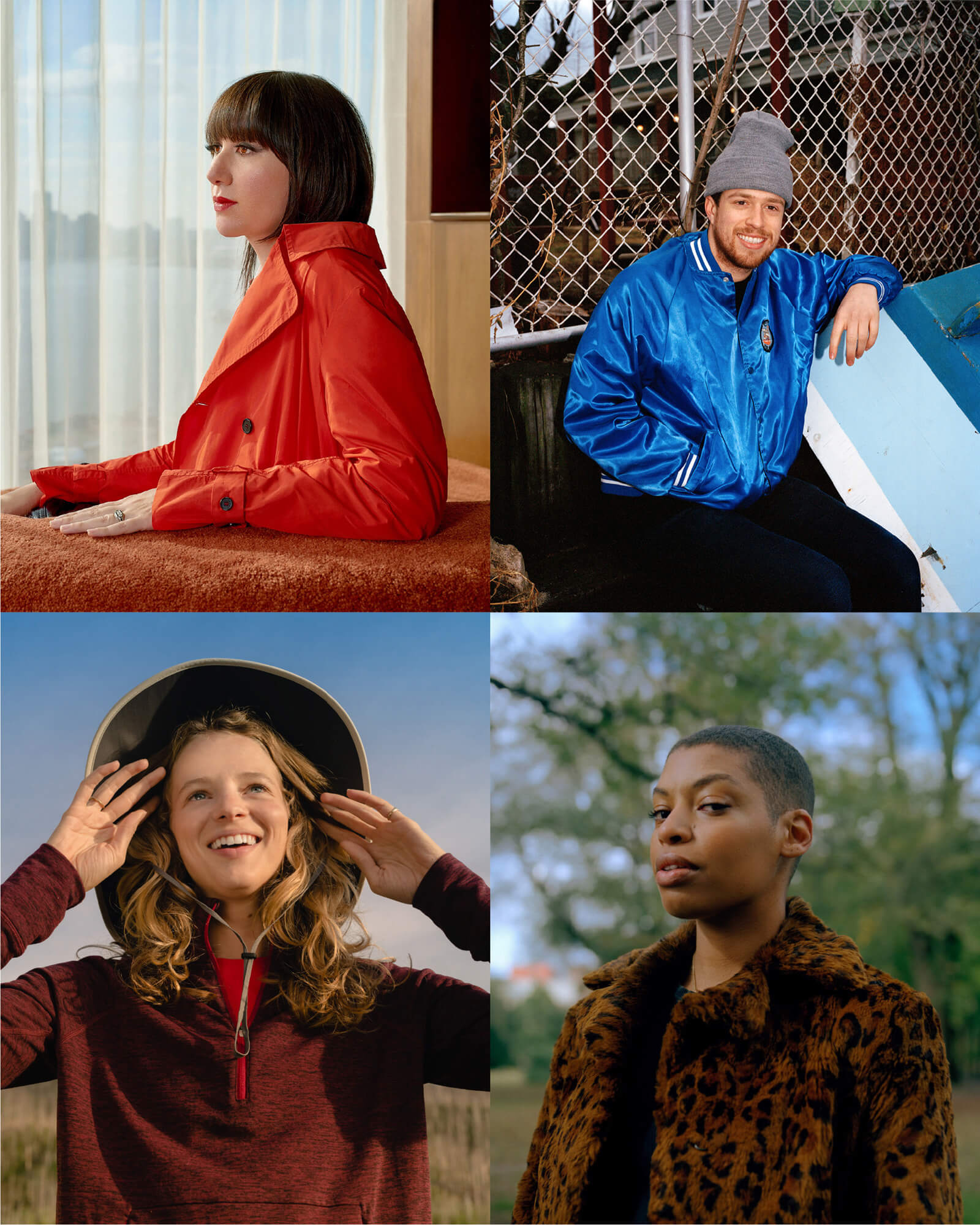
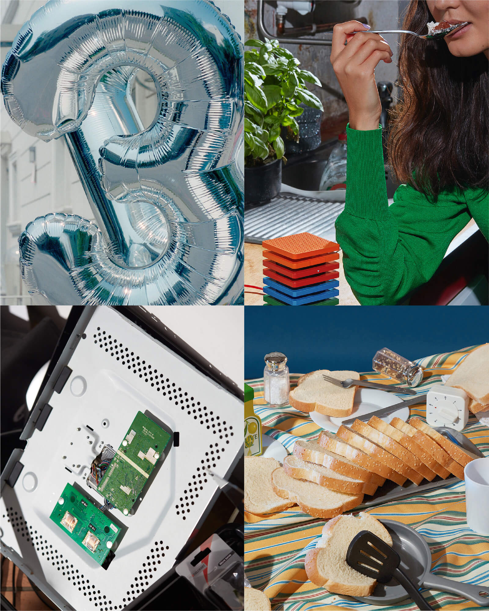
Celtra’s identity works with different types of imagery and uses various principles to maintain consistency and recognizability. Imagery can both enhance user experience and express the brand's tone. There are four types of imagery: graphics, illustration, photography, and icons. Each category has its own rules, but they all follow three general principles:


Distinction
These aren’t the same as brand graphics. They should look and feel editorial.
Versatility
Consistency comes from quality, not by everything looking the same.
Style
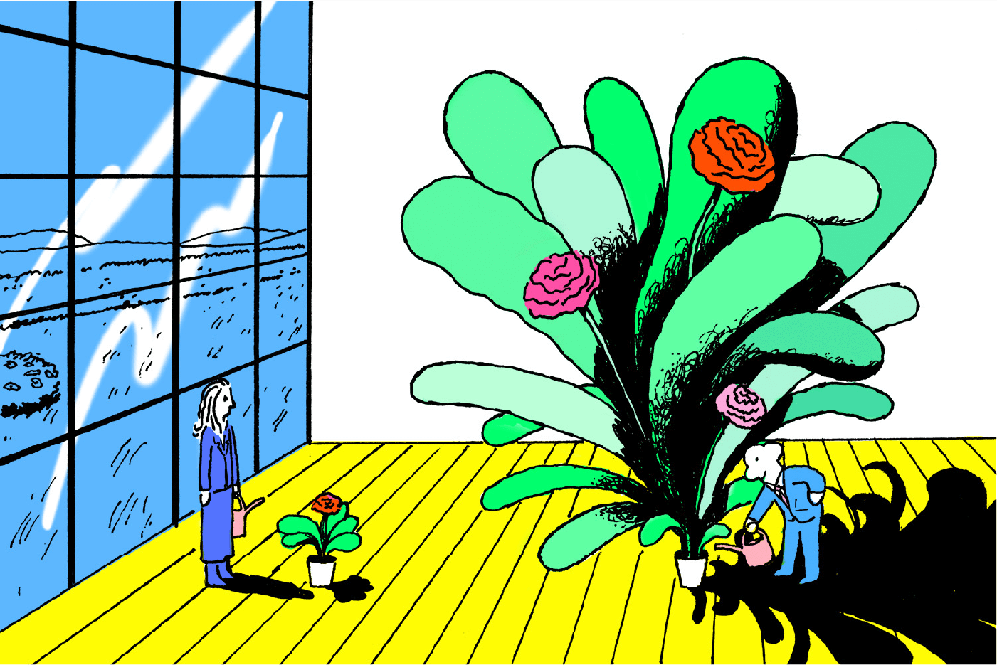
Embrace the illustrators and their unique styles. Pick the ones whose style is close to the overall look of the blog.
Limitations
Don’t let them get too carried away. Always consult the Celtra brandbook when it comes to colors and gradients.


Playful
Animations should be fun, approachable, colorful, and quirky.
Structure
Grids safeguard information hierarchy and make slides understandable.
Simplicity
Try to communicate with more motion and fewer elements.
Clarity
Simple typographic layouts should be used to keep slides clear.
Technical rules for animation can be found in a separate documents (Dimensions, Screencast, Export, Loop)
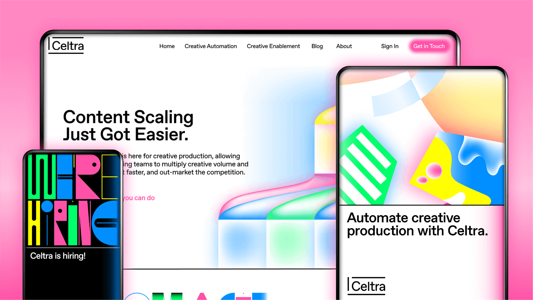
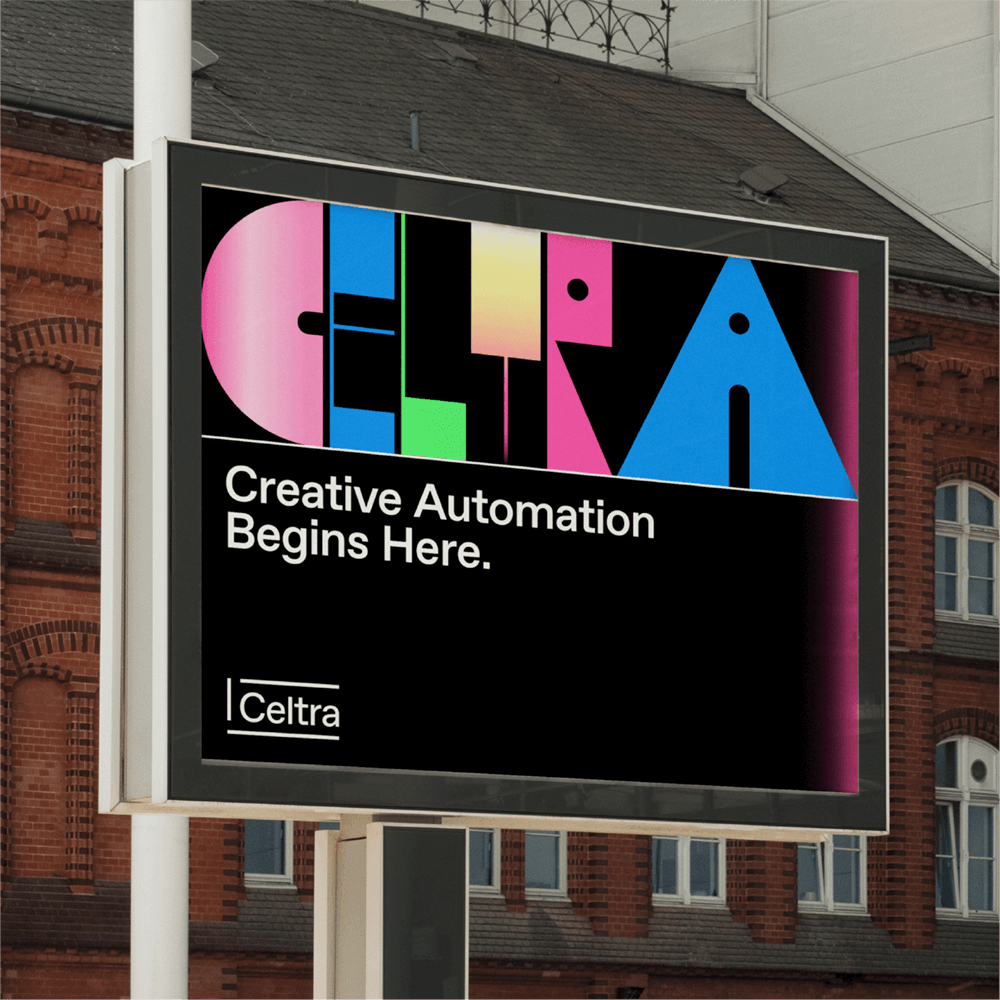
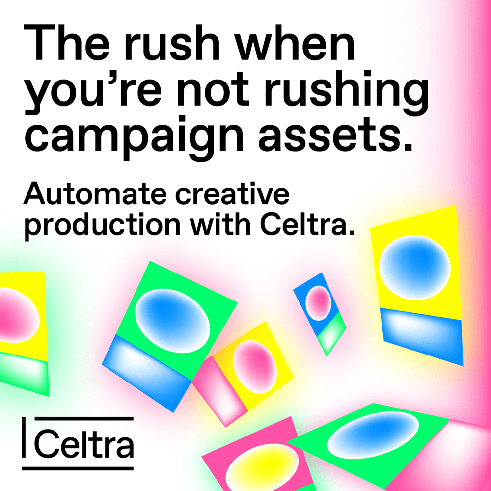
Every application has its own specifics, these are most commonly used materials with tips, rules and templates for creating new designs.
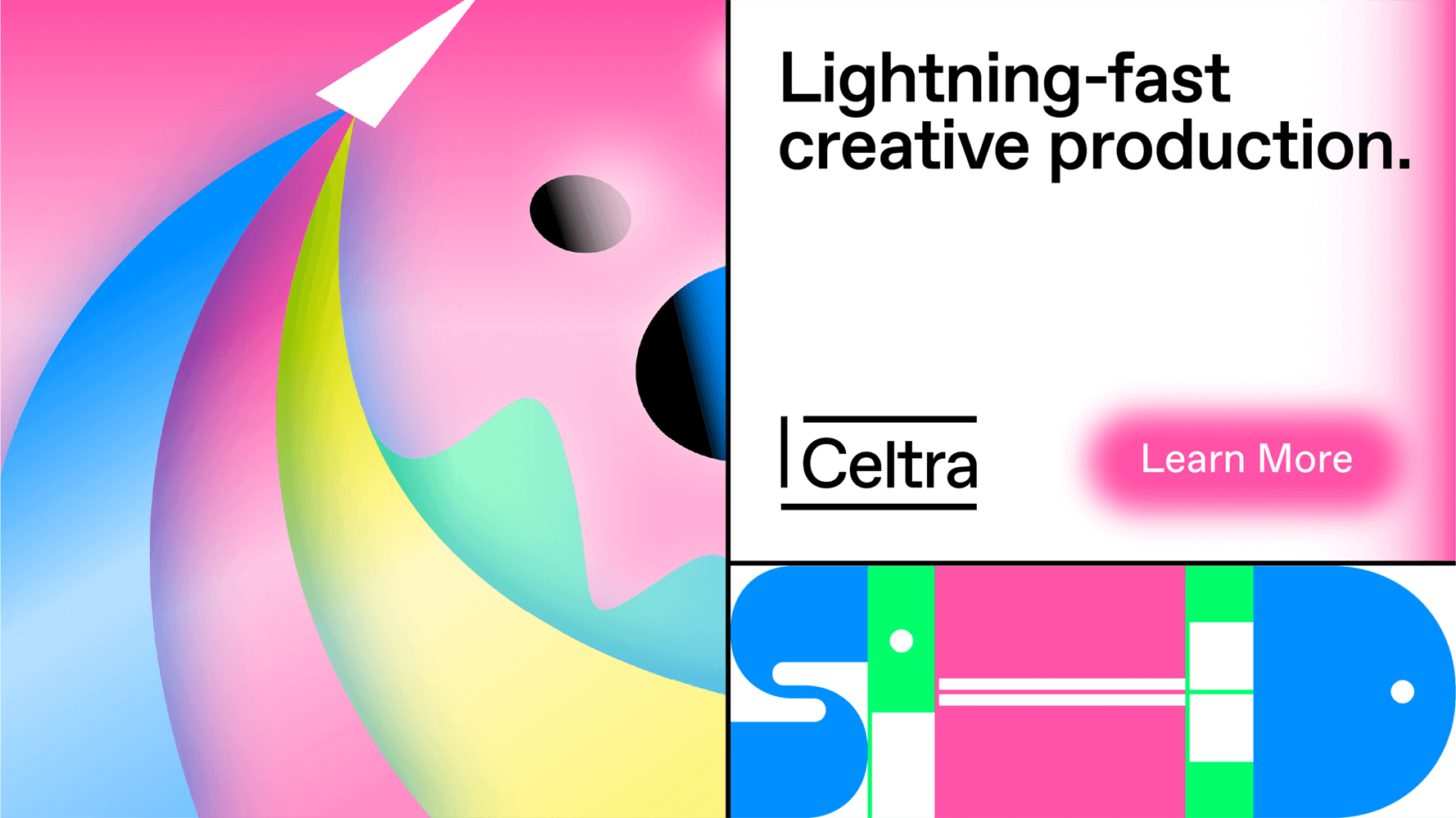
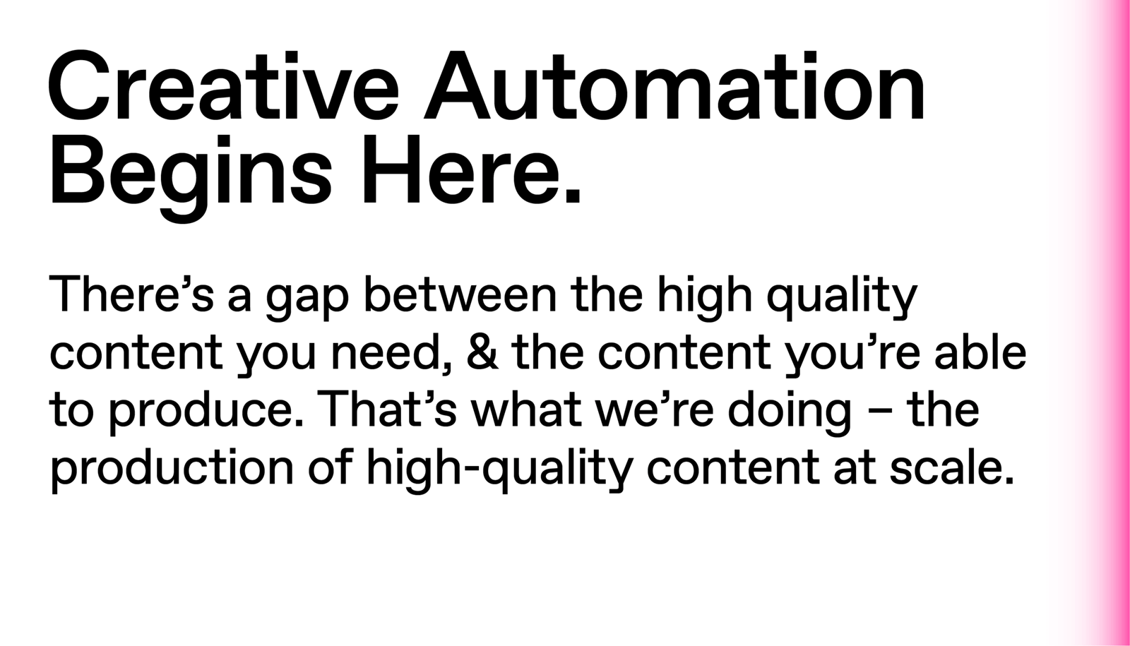
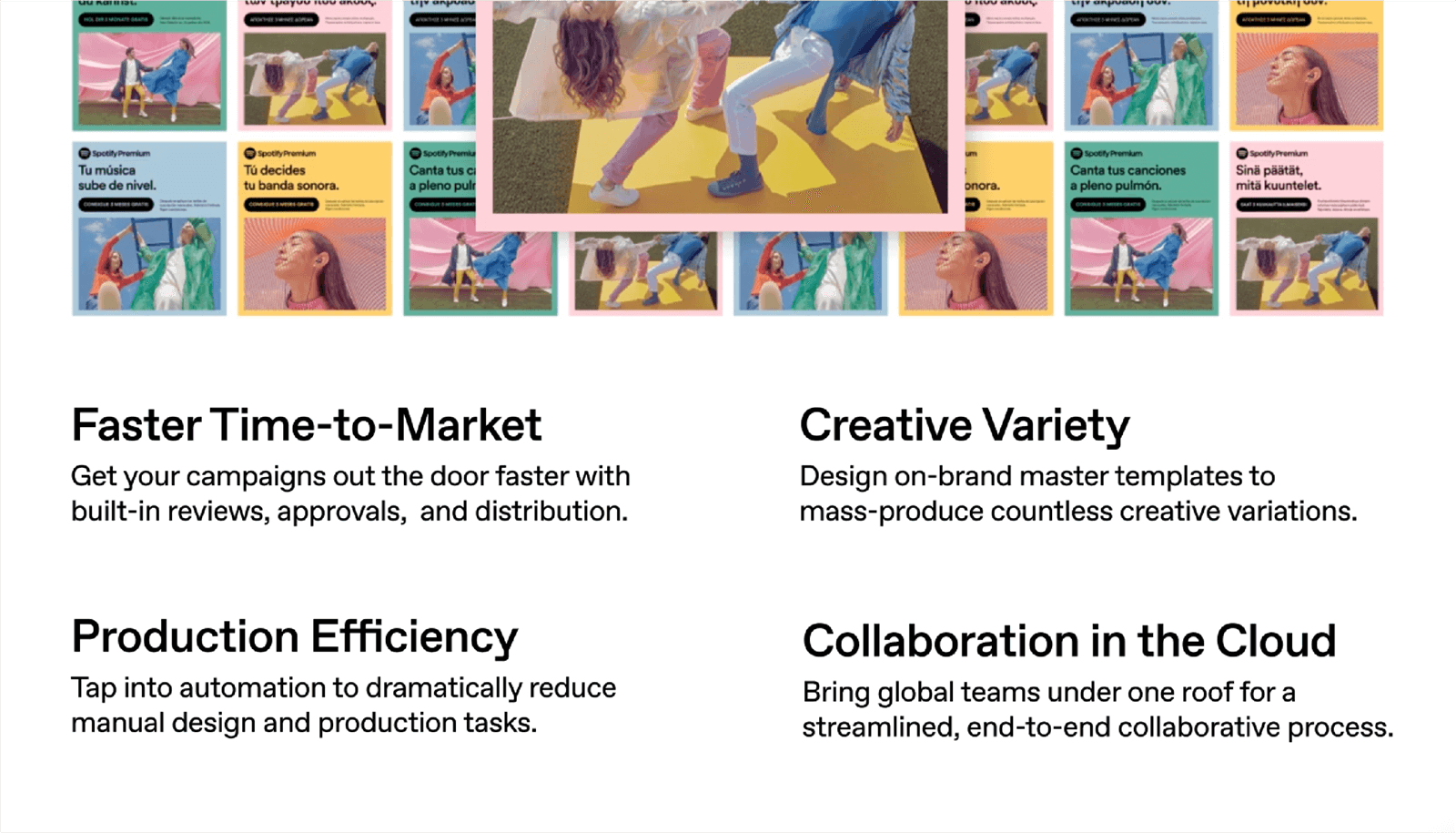
• Don’t overcrowd the slides.
• Use graphics, photography and icons to illustrate your points.
• Try avoiding mixing graphics and UI elements in the same screen.
• Refer to the animation segment of the brand book for motion examples.
• Avoid using animated graphics, because of the compression.
• Change covers at least every couple of months.
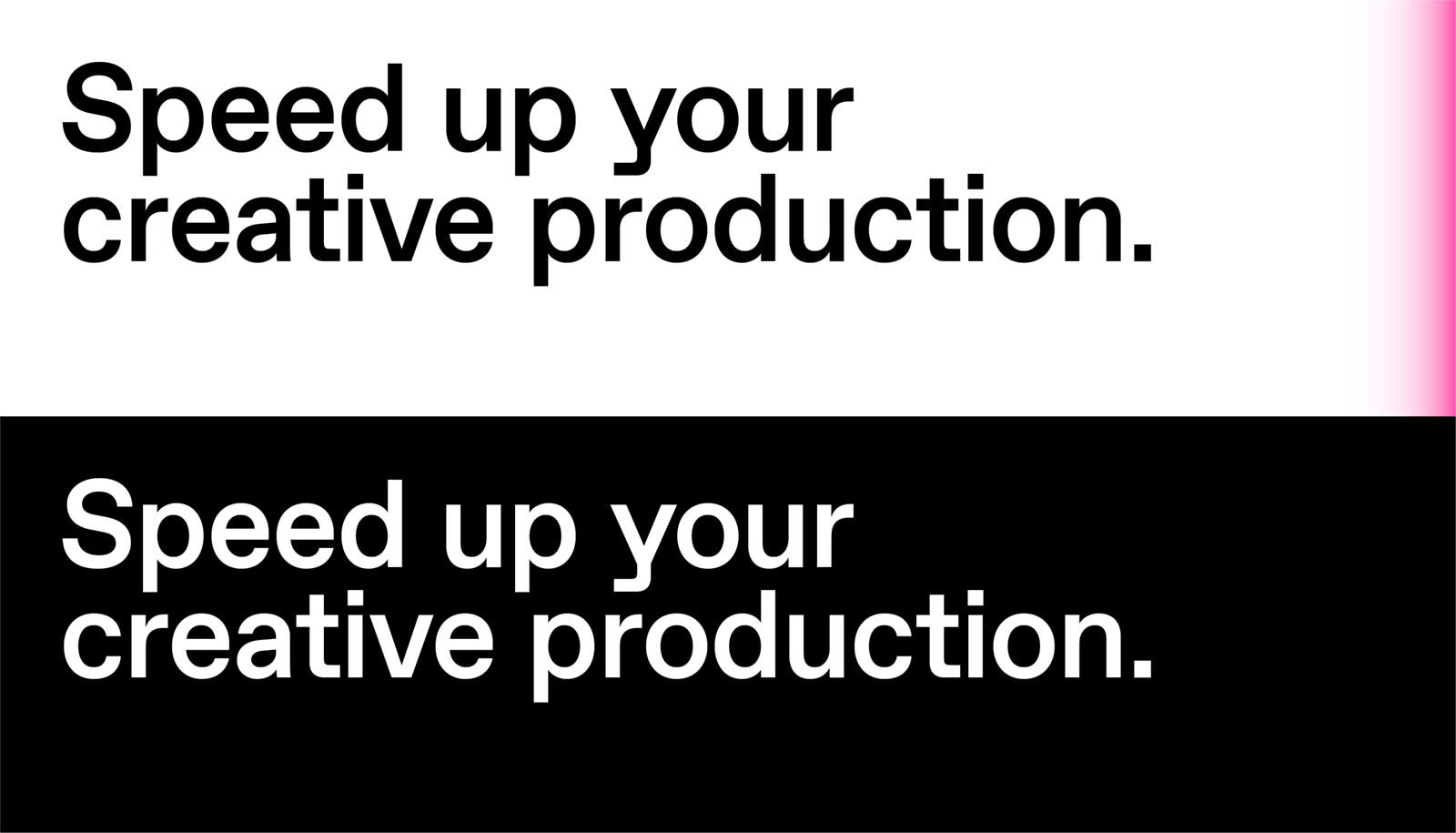
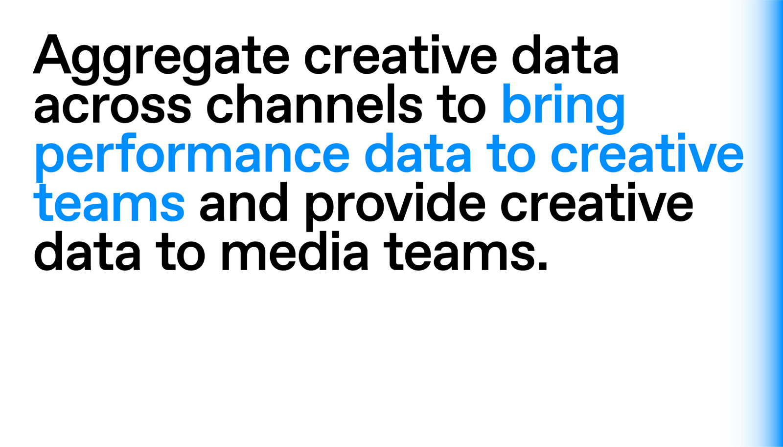
• Refer to standard grid & typography rules as defined in the brand book
• If there is a lot of content, split it in multiple screens.
• Refer to standard grid & typography rules as defined in the brand book
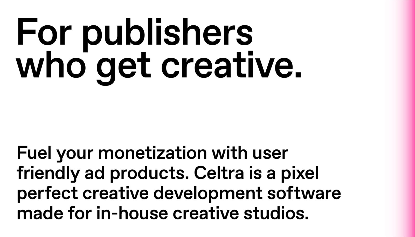
• Keep the copy short and adapt it to the situation or space where the ad is placed.
• Refer to standard grid & typography rules as defined in the brand book