for Employees
for Employees
Rules for the correct use of the logo and its replication.
Celtra Logo
A primary communication element.
Celtra Symbol
Used for limited sizes and social media avatars.
CA & CE Logos
Pairs Celtra logo with its products.
CA & CE Symbol
Used for limited sizes on products.
Internal Teams
Departments can have their own distinct wordmark.
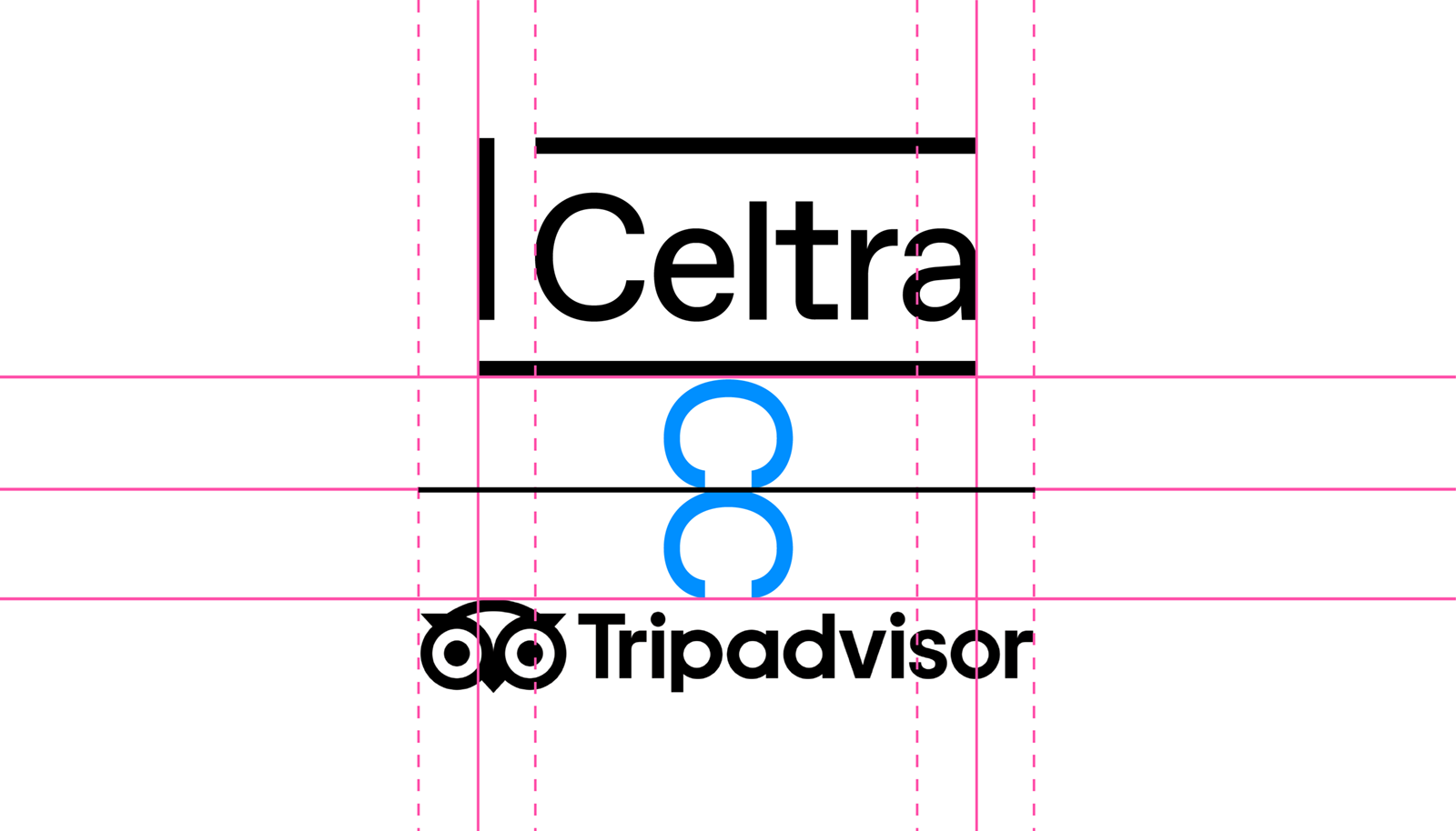
The Celtra logo represents a frame based on the grids that form the visual identity. It’s carefully constructed to maintain its ownable characteristics while allowing a high degree of legibility at any size on any application.
The logo is designed to scale to small sizes on print and screen.
Smallest size: 20 pixels / 0.3 inch / 8 mm height.
Celtra’s identity utilizes a wide range of colors and gradients. You should use this palette in both functional and surprising ways to create unexpected and bold designs.
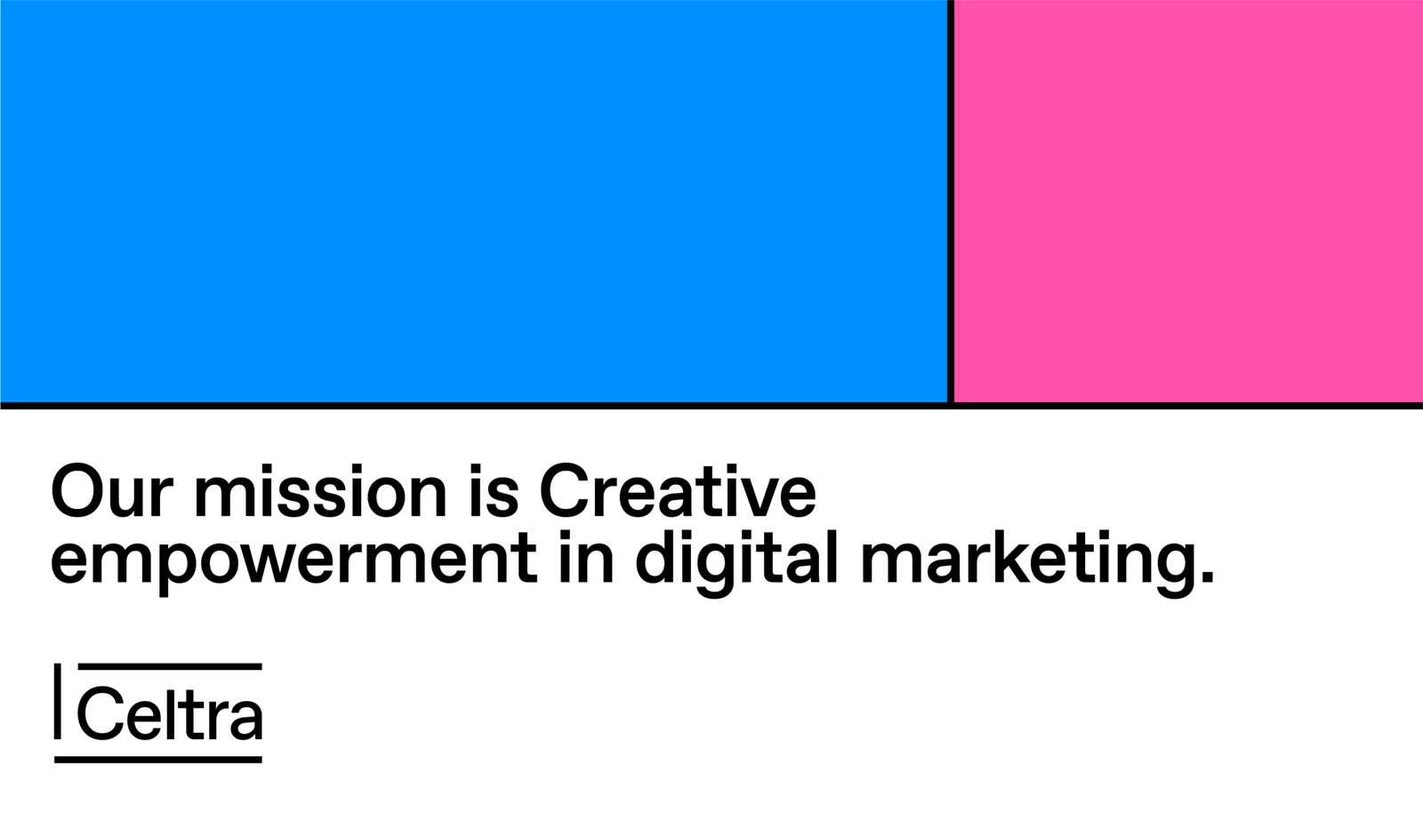
The primary brand colors are Celtra Lollipop Pink and Celtra Candy Blue. They always appear in full tone. When it comes to these colors, there’s no room for DIY - they shouldn’t be darkened, lightened, or displayed transparently.
RGB — 255 81 167
CMYK — 0 100 0 0
Pantone 806
RGB — 0 143 255
CMYK — 100 40 0 0
Pantone Process Cyan
The background color is mainly white or black. But since the world isn’t black and white, the color palette can be extended to include grey tones for functional applications of user interfaces.
RGB — 255 255 255
CMYK — 0 0 0 0
RGB — 0 0 0
CMYK — 0 0 0 100
The secondary brand colors are Celtra Lemon Yellow and Celtra Peppermint Green. They should be used sparingly throughout illustration, photography, and product to maintain meaning and potency.
RGB — 255 255 0
CMYK — 6 0 100 0
Pantone Process Yellow
RGB — 0 255 108
CMYK — 50 0 100 0
Pantone 802
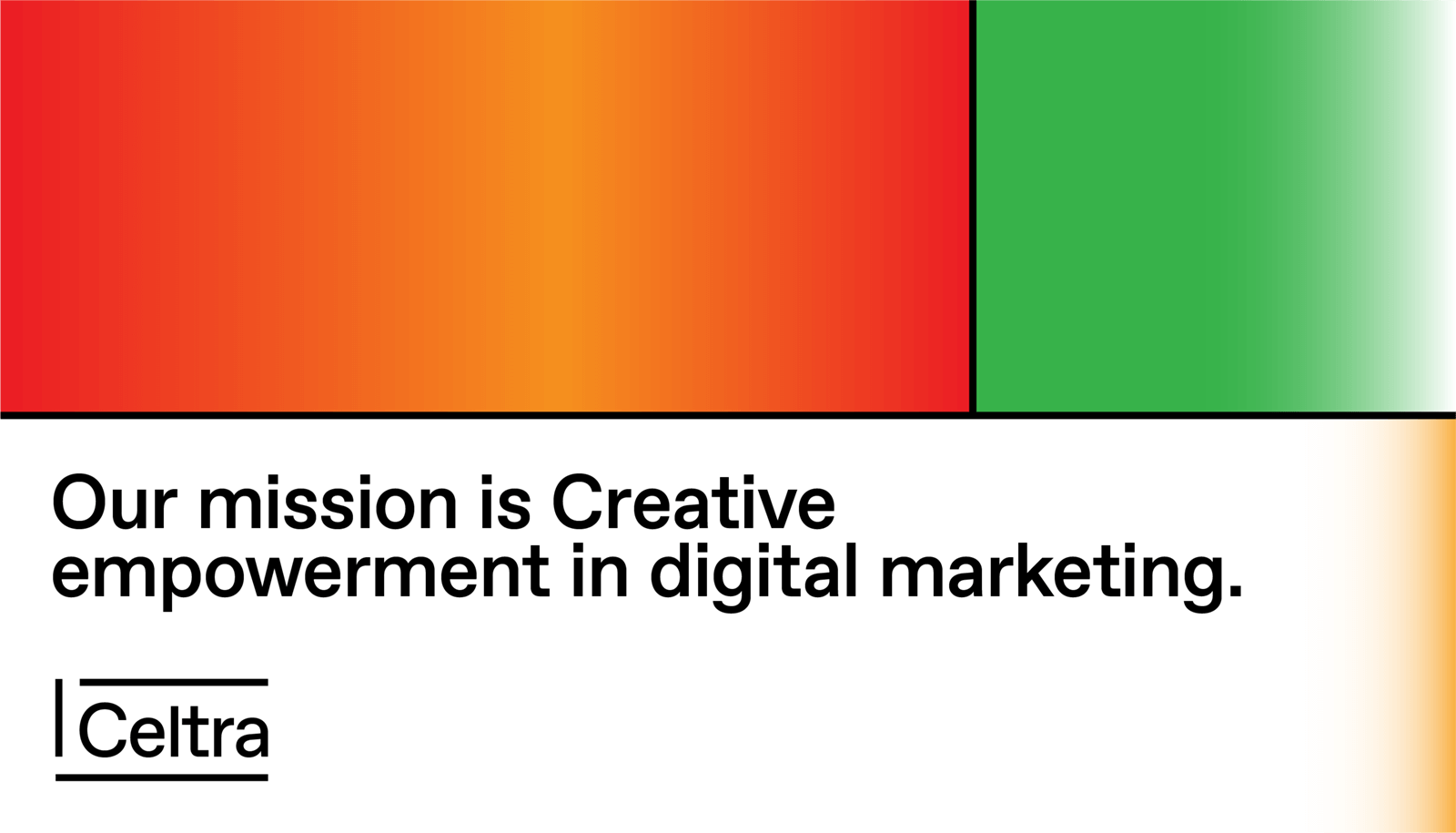
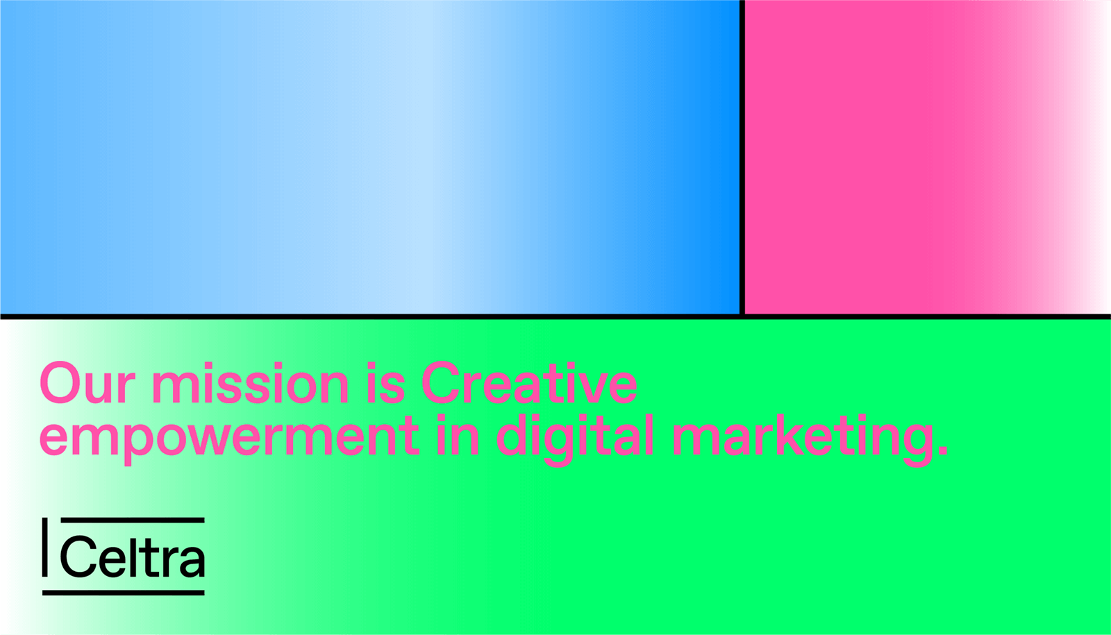
These are predefined swatches that derive from primary and secondary colors and are available for download. While you should aim to make the content as dynamic as possible, the look is all about consistency, so however much you’d like to, don’t mix gradient colors on your own.


Primarily used for CA applications.

Primarily used for CE applications.
A short gradient finish on the main text background establishes the recognizability of Celtra’s language even on the smallest of materials. It should be used when possible, with the following settings.


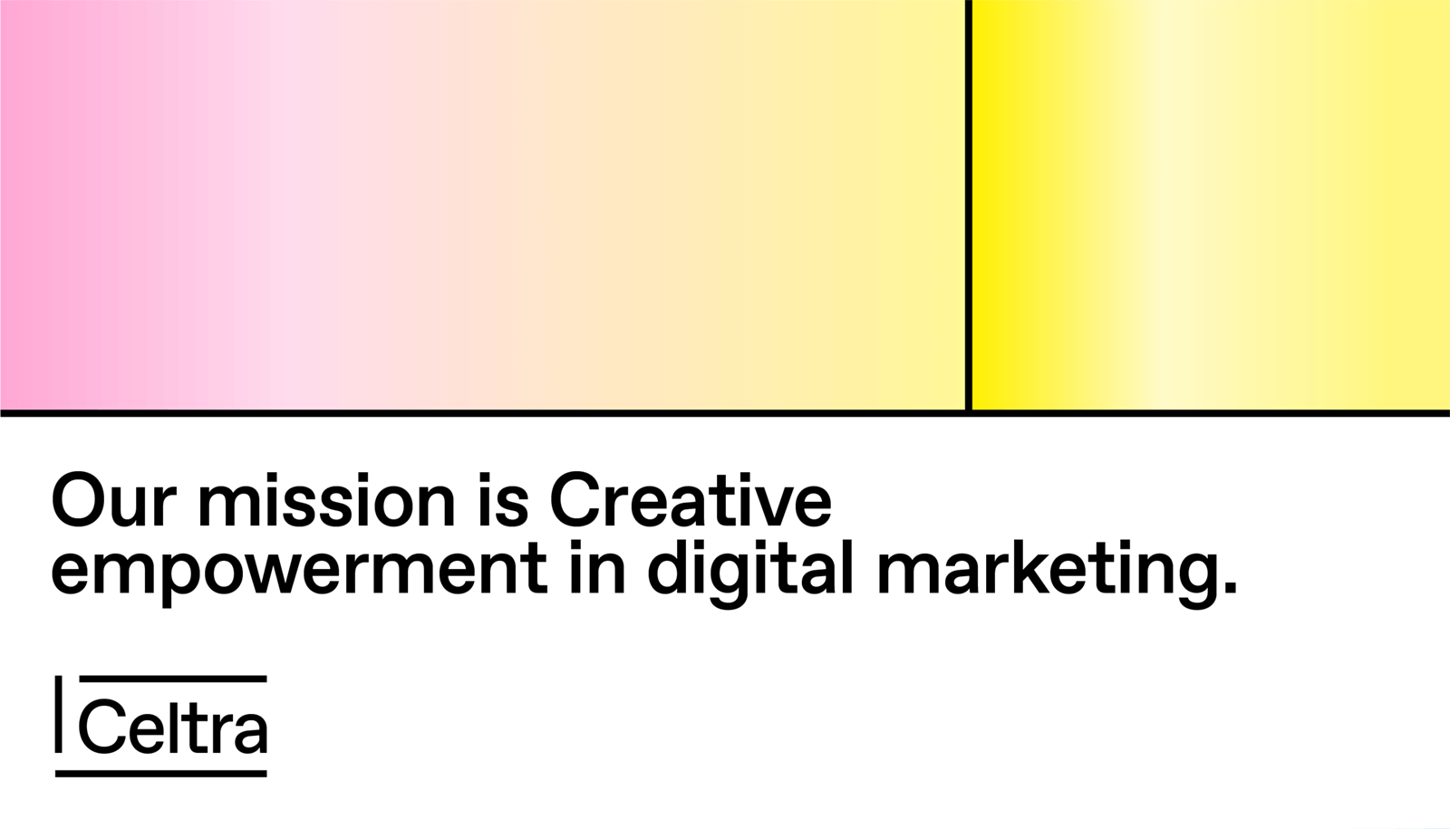
We aim for clear and exciting typographic structures to enable consistent visual communication across all media.

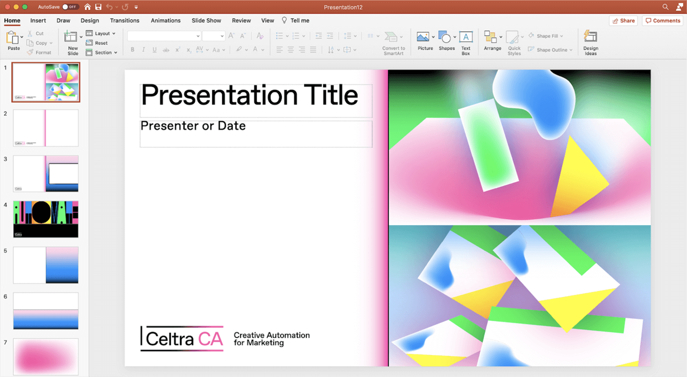
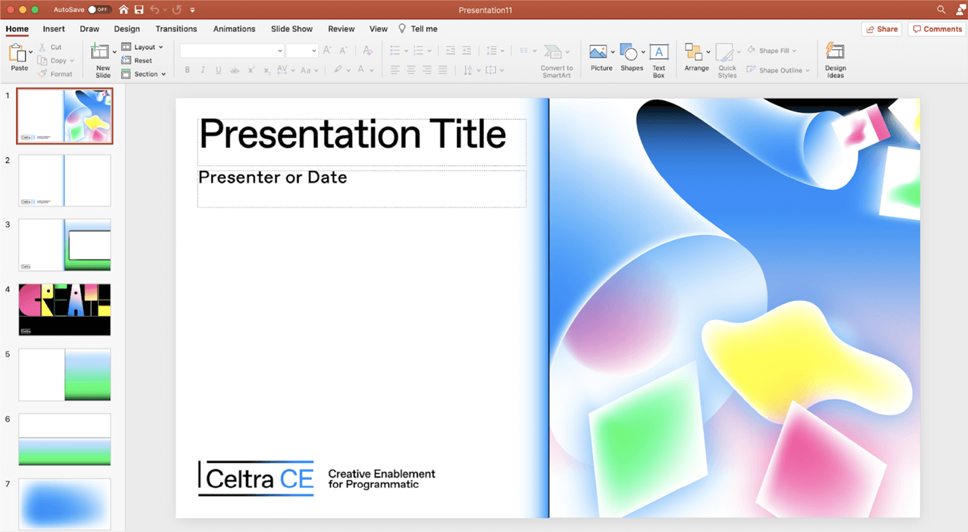
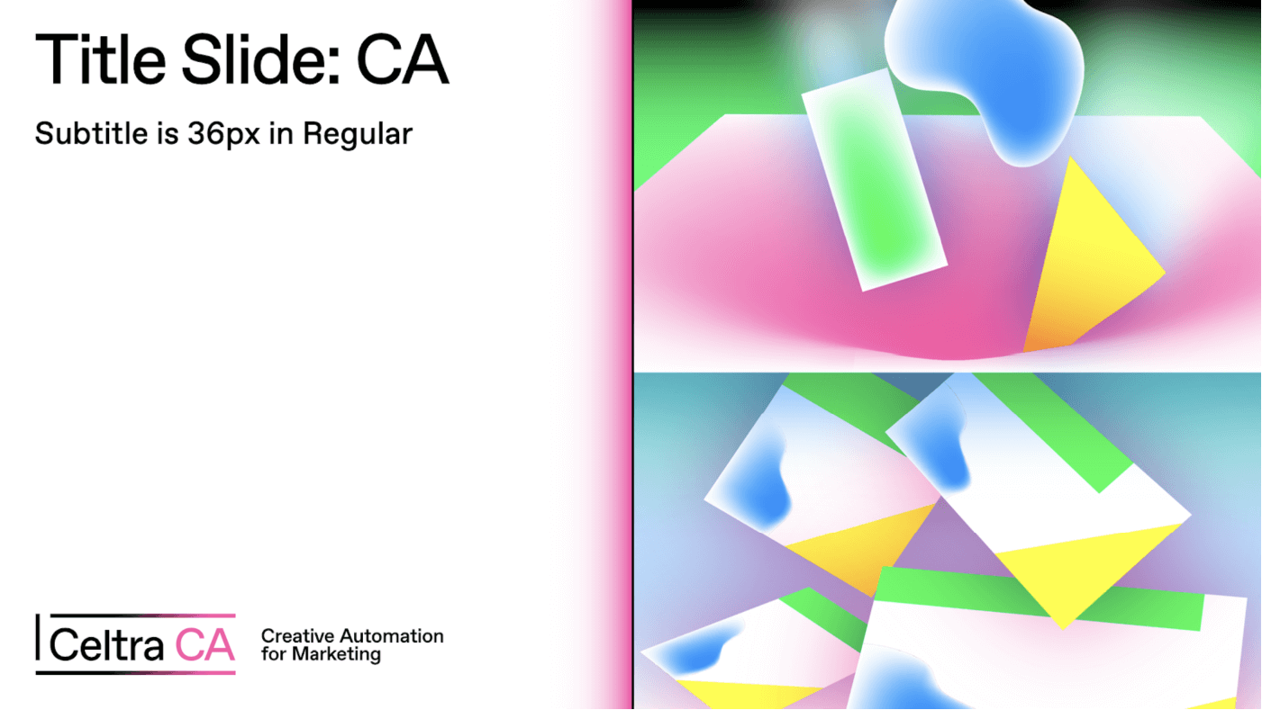
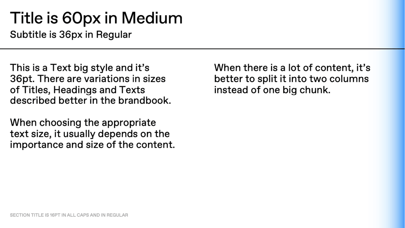
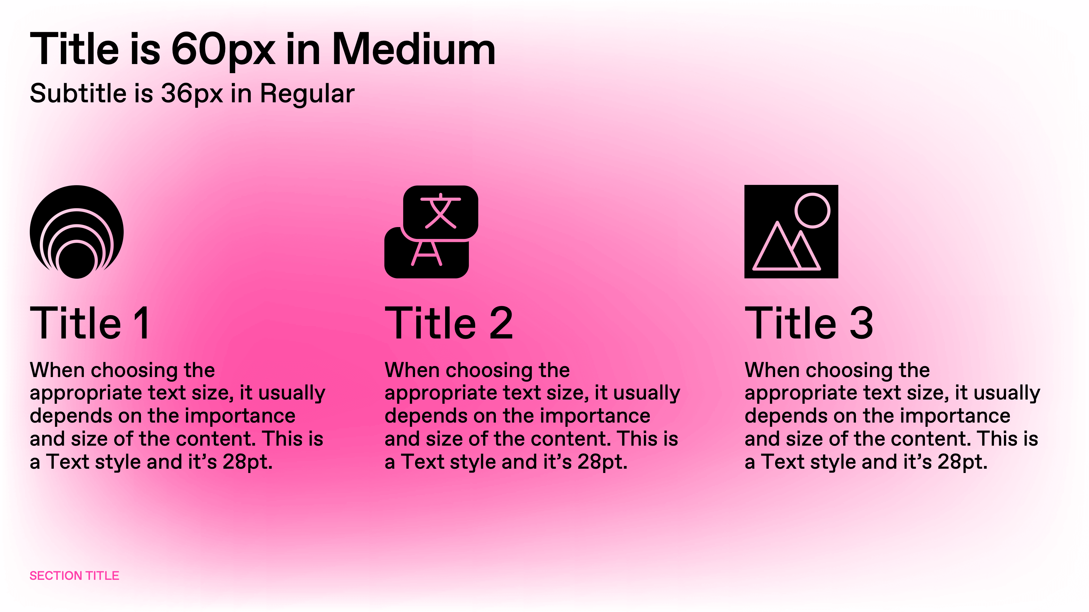
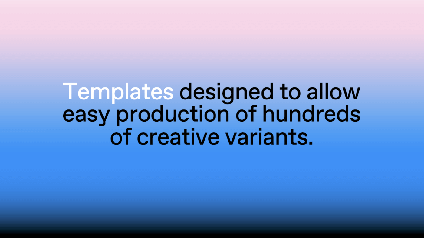
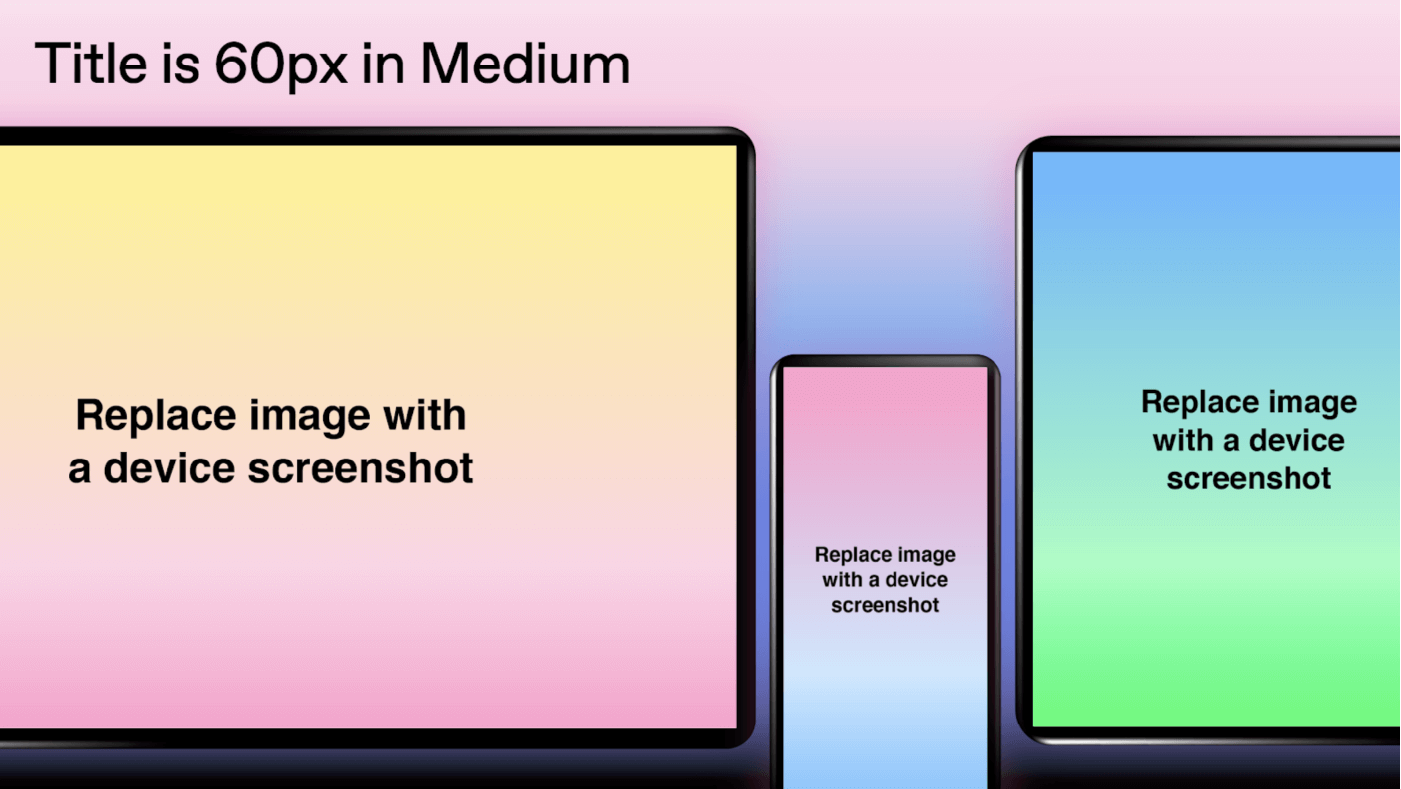
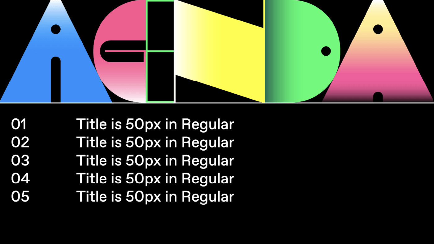
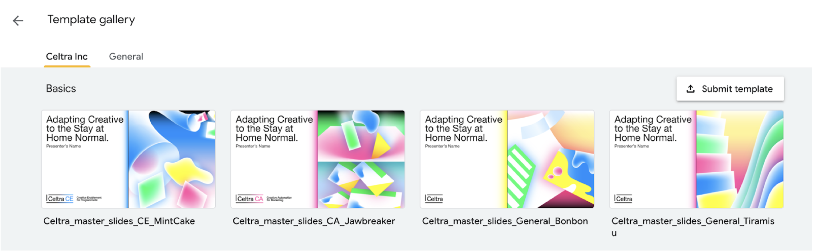
Powerpoint and Google Slides templates are available in 4 different color variations designated for specific or random content options. Templates should not be mixed, in order to obtain consistent look and feel across our presentations. Use CA and CE designated templates only for product-related content.
All presentations are templatized so there is no need to copy them - simply click on the chosen template and start editing.
Please make sure you read through the Presentation Usage Guidelines before the use.
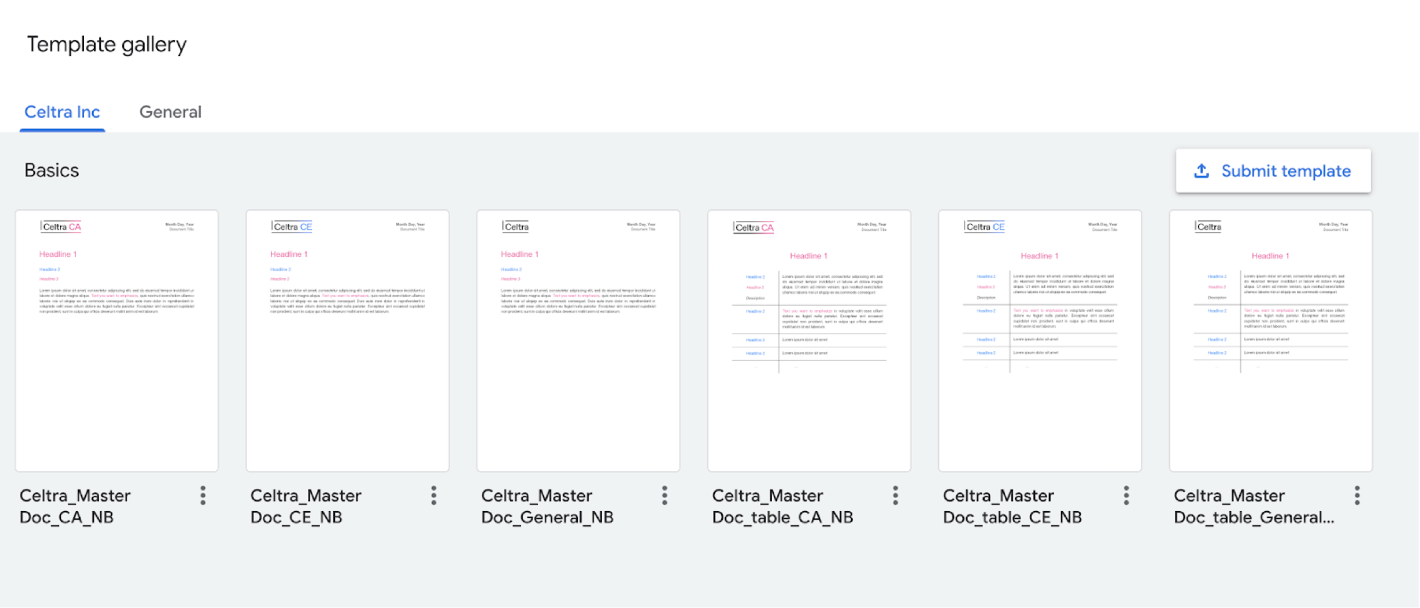
Word and Google Docs templates are available in 2 different content variations, set up for general and table usage. Use CA and CE designated templates only for product-related content.
All documents are templatized so there is no need to copy them - simply click on the chosen template and start editing.
Make sure you follow these instructions when updating your signature.