We’ve come a long way since the early days of Celtra. Back in 2010, we knew mobile would be big, so we took on the challenge of making mobile advertising creative. We introduced a browser-based design and production software product built specifically for this new digital channel. We enabled designers and an entire ecosystem of creative advertising stakeholders.
Ten years later, our objective remains the same, but our mission is broader. We still enable creativity, focusing on the challenges brand marketers and their creative teams and agencies face today.
The demand for more content keeps growing with constant proliferation of new digital channels and increased demand for personalization. Yet, production resources and budgets are not growing to meet these new creative demands.
We call this phenomenon The Content Gap. It’s the delta between the content marketers need to succeed and the resources they have available. This is the challenge we are currently tackling, working together with phenomenal brands like Spotify, adidas, YETI, and many more.
“With our new and larger ambition of solving the Content Gap with Creative Automation, we realized that our branding needed to reflect this shift, too. It was time to create a new identity to reflect the company’s evolution both internally and externally as we build out the Creative Automation category.”
Miha Mikek, Founder and CEO, Celtra
New Visual Identity for a New Category
This summer, we embarked on a rebranding journey to discover a visual identity that would stand the test of time, resonate with our open creative culture, and communicate our pioneer mentality.
Today we’re proud to present our new exciting look:
The Cornerstones of Our Rebrand
We were aiming for a visual identity that would feel dynamic, innovative, design-centric and most of all, unexpected.
We entrusted the challenge to Ljudje design studio who collaborated with the independent designer Nejc Prah. Ljudje is one of the most acclaimed design studios in Slovenia and Nejc Prah is an internationally recognized and awarded designer. With Celtra’s Slovenian roots and heritage, it made sense for us to partner with local talent.

Both Ljudje and Nejc have known Celtra, its people, and culture from the very beginning so it was easy for them to capture the energy and spirit with a visual style. They won us over with a unique aesthetic and a strategic design approach that we strongly felt could be very much our own.
The identity is versatile and aligned with Celtra’s pioneer position in the creative technology space. The design language represents our unique creative culture, balancing human and high-tech as one.

The new identity moves away from having the logo as a core element. Instead, it is built around a vivid visual language that can adapt and transform based on different content needs. The identity doesn’t follow trends but sets its own category and visual language. It’s inspired by the multiscreen world we live in where you have seconds to attract someone’s attention.
“We’ve been impressed by Celtra’s energy and wanted to translate it into a bold and exciting visual language. The goal was to design a system that not only stands out but can also represent Celtra as a unique player in its field. Our aim was to achieve a balance between playful and serious while establishing clear rules for the use of all the elements of the new visual identity: from gradients to custom variable typeface and funky graphics.”
Ljudje and Nejc Prah
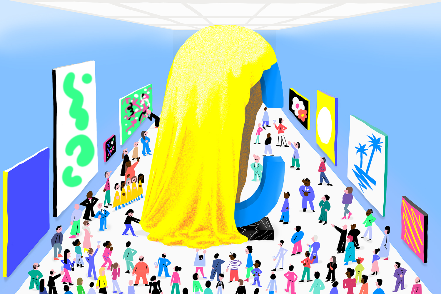
Uncommon and Remarkable Aesthetic

Our new brand identity owns an unconventional aesthetic and abstract language that evokes curiosity and creativity. Two key drivers of Celtra company and its solutions. Keeping in line with the creative spirit of Celtra, our new identity includes two distinct graphic and illustration styles: one being more abstract, the other more representative.
Graphics: Unexpected and Abstract
Celtra’s identity works with various types of imagery: illustrations, photography, icons, and most remarkably, graphics.
Our new graphics are made with a one-of-a-kind aesthetic that acts as an element of surprise, a curiosity, a humorous addition, or an abstracted explanation of the subject. They exist to evoke attention. Since Celtra’s products are often hard to visualize, metaphors are essential.
[videogif mp4=”https://celtralive.wpengine.com/wp-content/uploads/2020/12/3_Celtra-graphics.mp4″]
We use uncommon abstract visual language to oppose the plain and straightforward. While we advocate for less obvious ideas on the metaphor spectrum, the imagery is never just a random visual noise screaming for attention out of context. Meaning is important and the graphics enhance it.
Blog Illustrations Are Unique Every Time
Consistency comes from quality, not from having everything look the same. Therefore, we commissioned various artists to create a variety of blog illustrations. While they all work with the same color code, illustrators’ unique styles are preserved and embraced.

Nitro: a Custom Variable Typeface
Another unparalleled element of our new identity is the custom variable typeface Nitro. It adapts its size and takes inspiration from limitless digital formats. Nitro can work as a graphic, a substitute to imagery, or as a short title to deliver strong statements across our public-facing or internal communications.
While we use Nitro as an additional asset for the advancement of our storytelling, we chose Favorit as our primary type. It is a straightforward, low-contrast type that combines a contemporary look with a humorous touch. Favorit will be the most widely used font for Celtra.

[videogif mp4=”https://celtralive.wpengine.com/wp-content/uploads/2020/12/Nitro_Variable-Animation.mp4″]
[videogif mp4=”https://celtralive.wpengine.com/wp-content/uploads/2020/12/5_Celtra-Nitro-variable-font-b.mp4″]

Celtra Logo: the Yin of the Identity
While our new logo is a primary communication element, it is intentionally less imposing to work as a solid yin to more vibrant and playful visual elements of the visual identity like graphics and the custom variable font. Its primary version has its product variations to represent our range of solutions across communications.
Jawbreaker, Mint Cake, Lollipop, Tiramisu
Jawbreaker, Mint Cake, Lollipop, Tiramisu are just a few of the vibrant and playful gradients and swatch colors on our new color palette. They enable a wide creative playground for the design of our applications.

Applications
All design elements of the reimagined brand identity come together as a powerful representation of the Celtra company and its solutions across various channels and applications.


