More people are online and working from home than ever before. This change in behavior even has shoppers spending an extra $1.2 billion during work hours. Although e-commerce is booming, it means that advertising content needs to stand out to avoid getting lost in the mix. If every shoppable ad starts to look and feel the same, then viewers will tune them out.
Now is the time for publishers to get creative with their shoppable ad products. More ad product variety means more impactful ways to tell an advertiser’s story across your media, but where should you begin? To help you get inspired, we rounded up some of our favorite shoppable ad formats for your growing product suite.
Dimensional content overlays
Shoppable units don’t have to be basic. Adding dimension through layered capabilities is an effective way to add excitement to a shoppable unit. In this Mozoo / Nuxe example, the interactive content overlay featuring a product gallery captures the look and feel of the advertising brand without overwhelming the viewer’s experience on the publisher site. Not only is this inviting for the user, but it mimics the way consumers already browse through products within the advertiser’s online store with product information and thumbnails. That way the consumer is invited to browse through the store products and ultimately make a final purchase.
Interactive scrollables
Create seamless viewing experiences for readers with interactive scrollables. As readers scroll, reactive scrolling units move with the reader through the content. This type of shoppable ad is more passive for the viewer but still provides engagement. With Mozoo / Hermès, the scrollable unit is taken to the next level by combining eye-catching video with an interactive product gallery. This creates a unique atmosphere for the advertised brand to lead with e-commerce while showcasing its look and feel.
Interactive grids
We’re not just talking about any shoppable grid. We’re talking about elevated shoppable grids. When you mix traditional interactive gallery experiences with video or static assets, you can create a dynamic shopping experience on your site that packs a punch. Take NBCU / Cartier. This approach was used to develop a one-of-a-kind experience that stands out amongst other ad units. The more your ad products can create rich shopping experiences, the stronger the impact.
Full-width product galleries
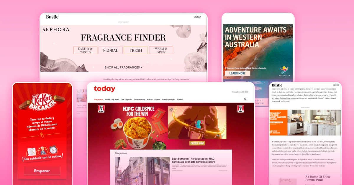
Take full-width ad units to the next level with beautiful, interactive galleries. In this example with Hearst Digital / Sephora, the crisp edge-to-edge product gallery highlights individual products while framing them within the creative for a fully integrated solution. Ultimately this creates an intuitive shopping experience for the viewer without taking away from their reading.
Site Skins
Bring the in-store experience online with Skins. With MediaCorp / KFC, the full-page takeover allows for an unmatched brand experience to promote new menu items and drive the viewer to order. The immersive nature of Skins unlocks more opportunities for product exposure and user interaction. Publishers can use Skins to take advantage of blank website space and tell a richer brand story along the path to purchase.
If you’ve been inspired by these shoppable ad formats, then it’s time to check out Celtra for Media. Amplify your product suite with Celtra’s shoppable ad experiences that cover all of the above examples, with the debut of Skins quickly approaching. Our software lets you combine images, motion graphics, video, and shoppable features while leveraging the best, advanced formats – including Interscrollers, Miniscrollers, and Expandables. See what’s possible with Celtra for Media by checking out our Collections page and send us a note to get in touch.

